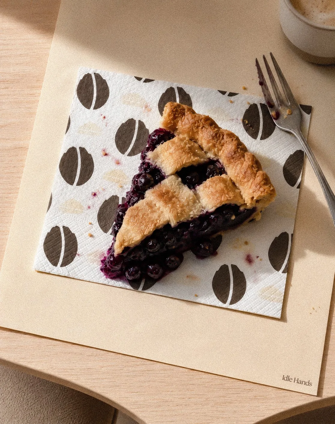
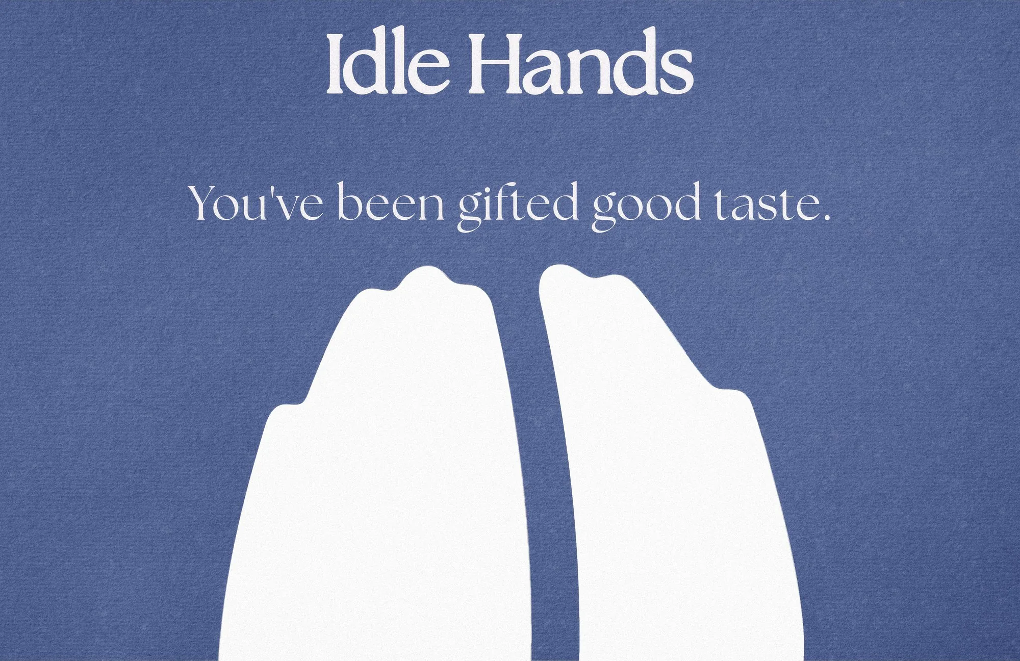
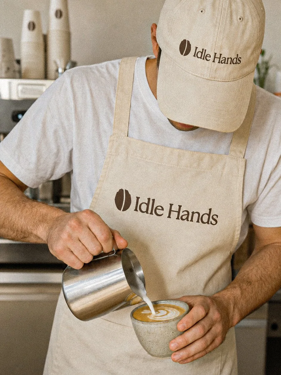
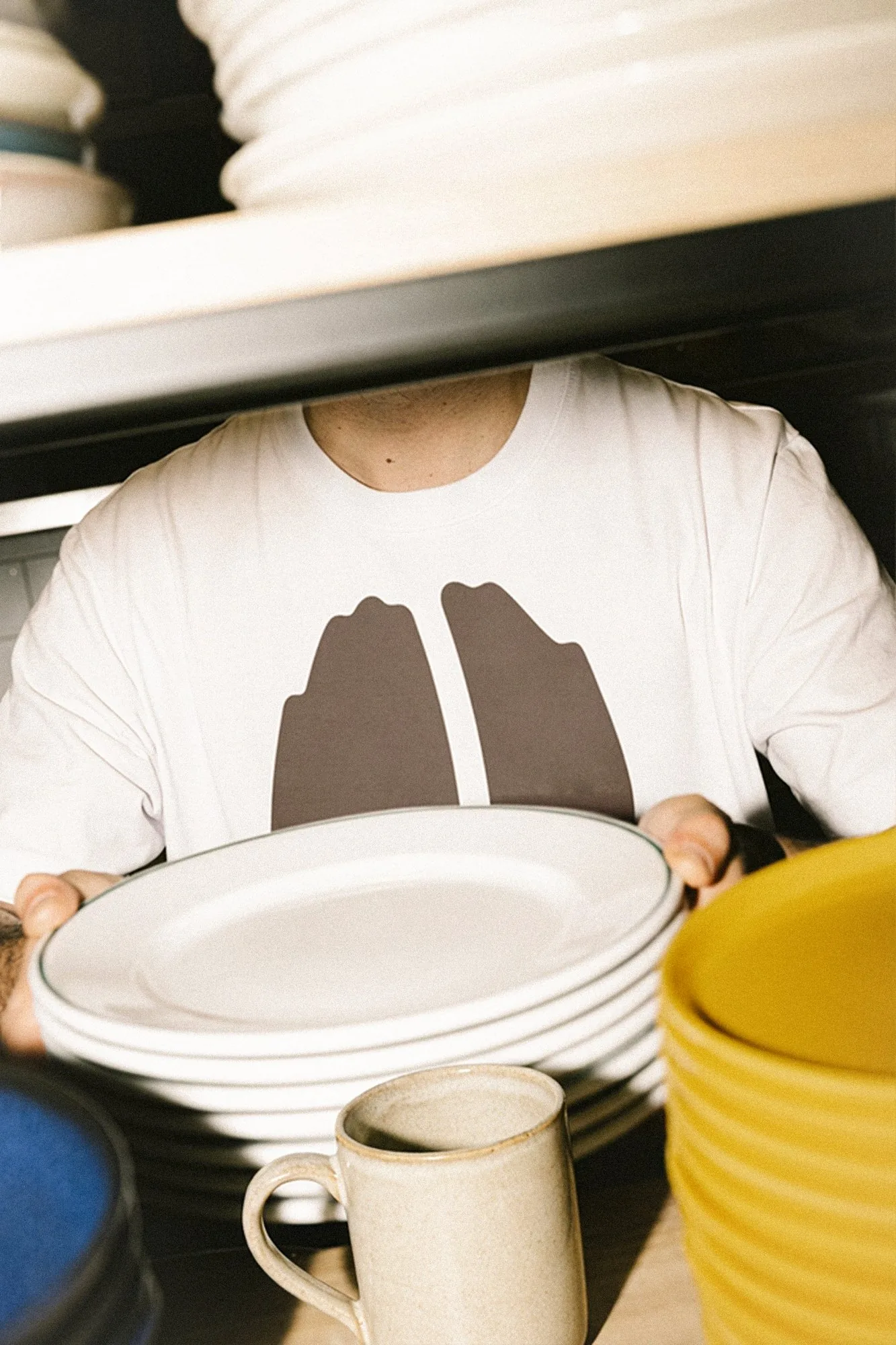
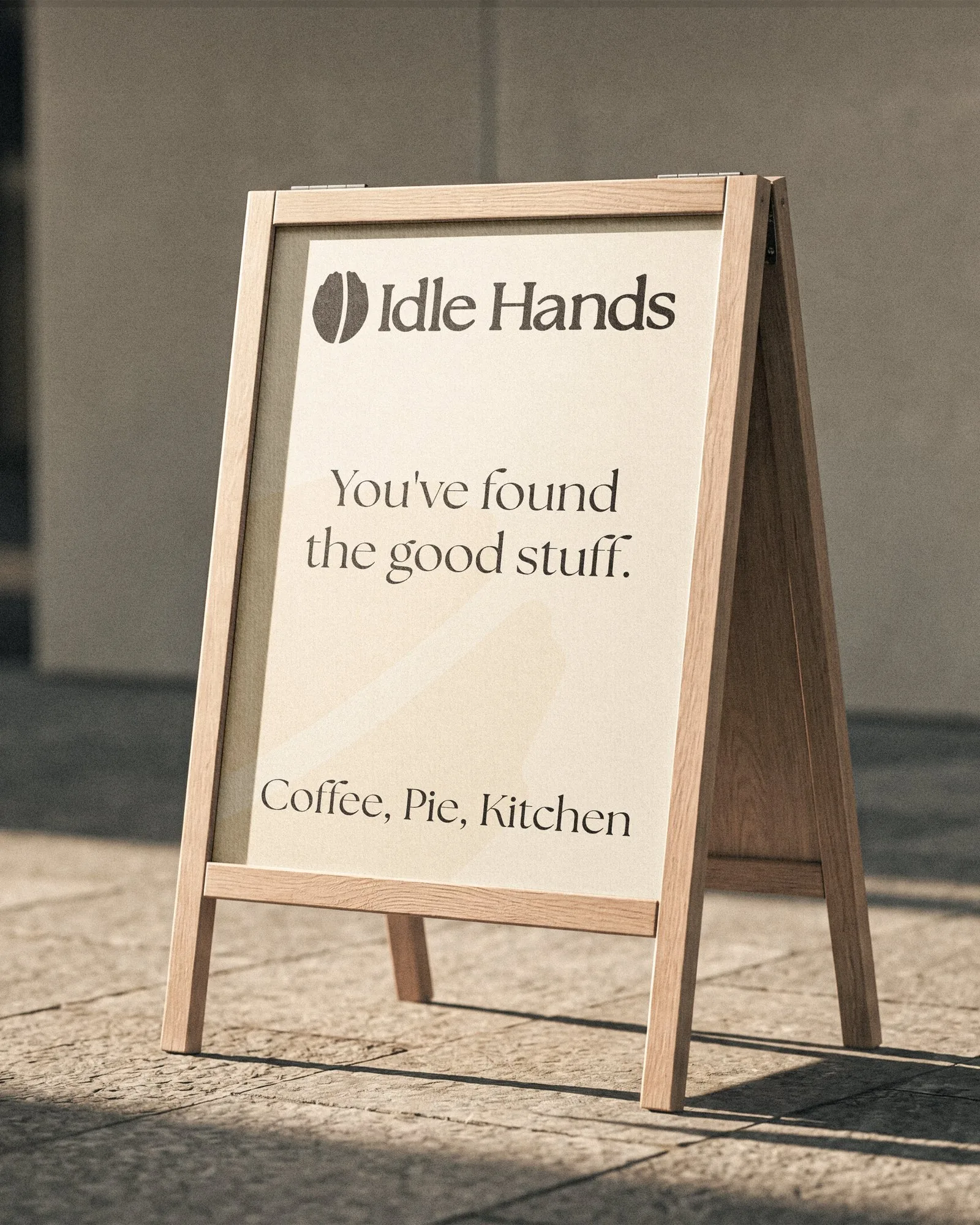
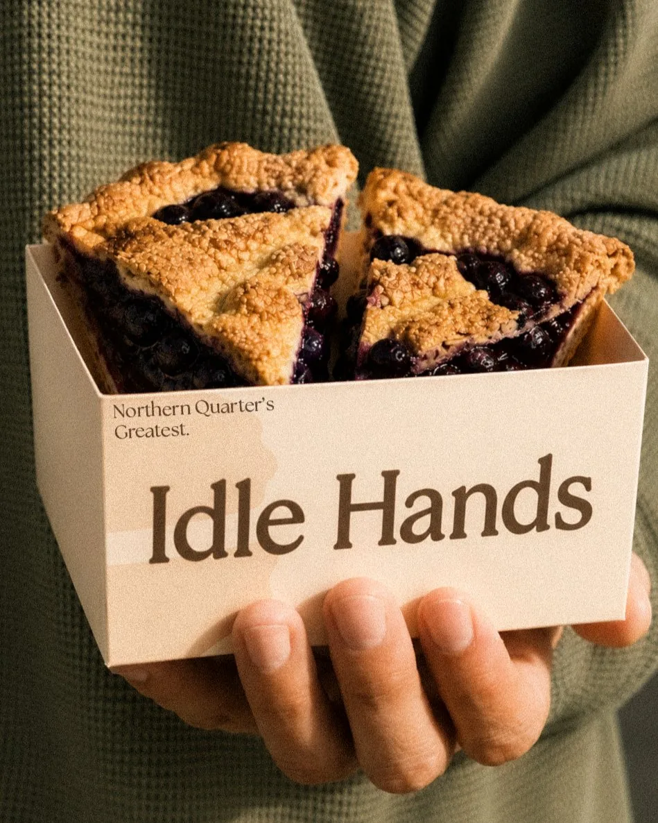
A concept identity for Idle Hands, an independent coffee house in Manchester that takes its time: thoughtfully sourced coffee, freshly baked pies, and a room built for slowing down. The brand had to feel as considered as the cup. We built it from two ideas, a pair of cupped hands and a coffee bean, and carried that one shape across everything that crosses the counter.
- Sector
- Coffee & pies
- Year
- 2026
- Scope
- Identity, packaging
- Status
- Conceptual study
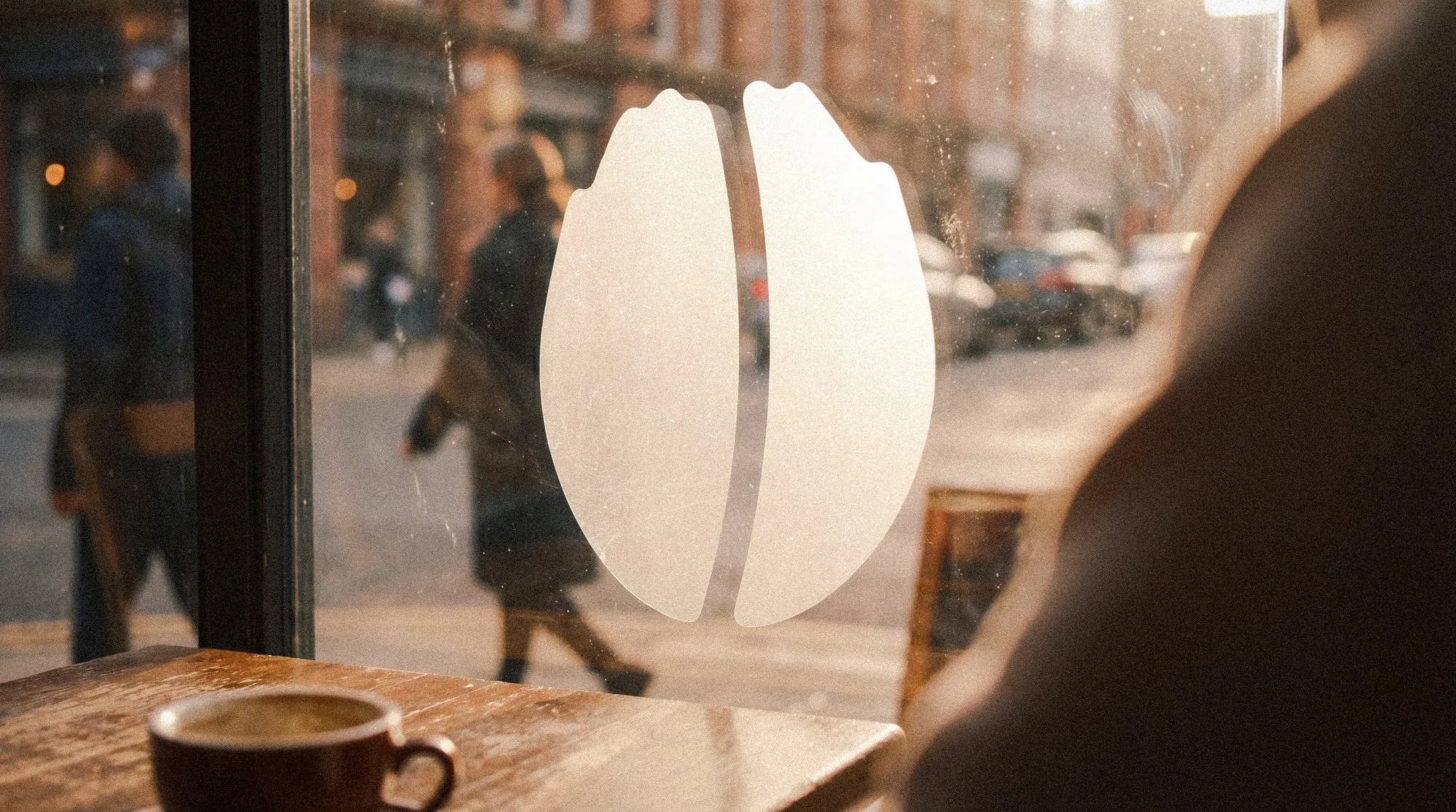
The mark.
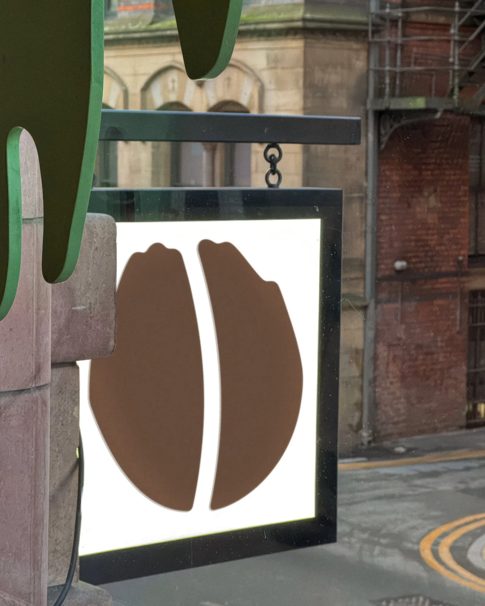
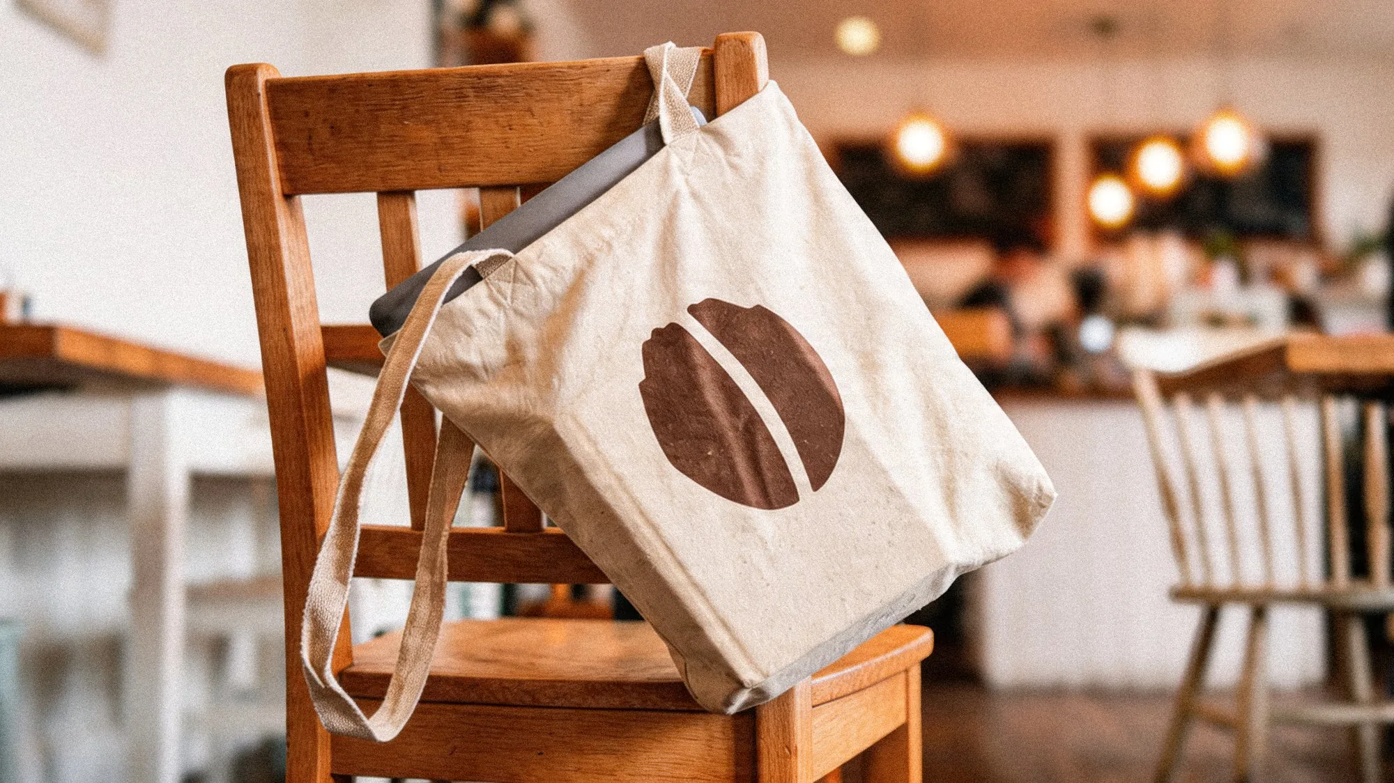
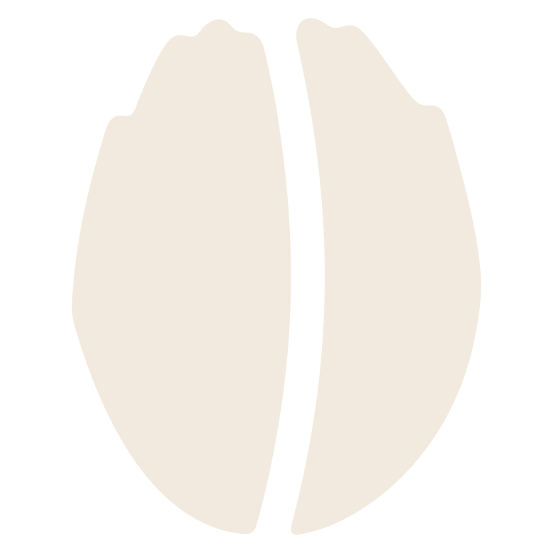
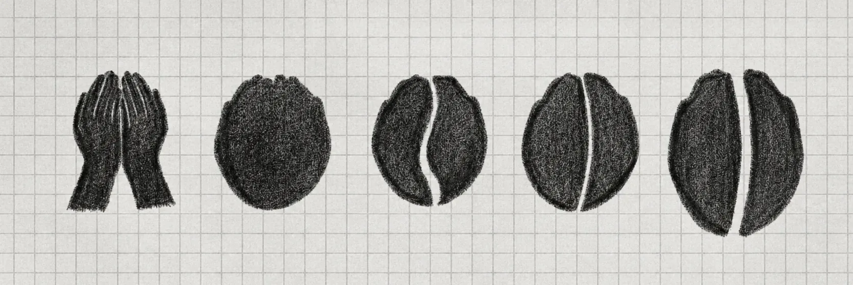
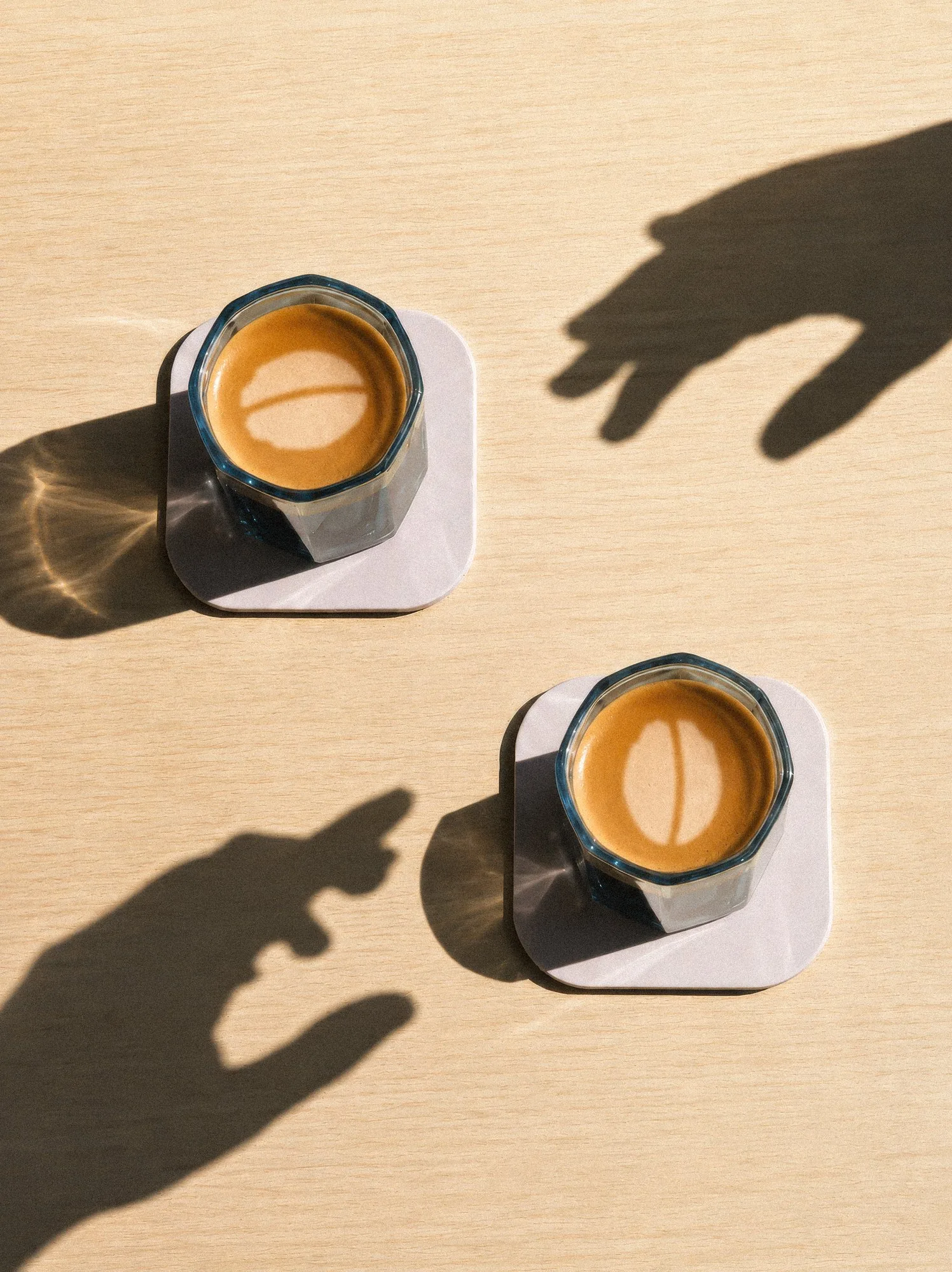
Two cupped hands, held together. Look again and they make a coffee bean. That is the whole idea: a welcome and the product in one shape, with nothing added. It stamps cleanly onto a pie bag, sits on a mug at any size, and reads from across the street on the sign over the door. The sketches show the route: hands, a circle, then the split.
The problem.
A self-initiated study. Idle Hands has been in the Northern Quarter since 2015 and the place runs on care: sourcing, brewing, pies made in-house. The brand never said any of that. The identity was a wordmark and not much else, with no mark to carry it onto a cup or a sign. Coffee, pie, natural wine and craft beer all sat under the same name with nothing tying them together. And a shop built on slowing down looked, on screen and on the street, like it was in a hurry.
The solution.
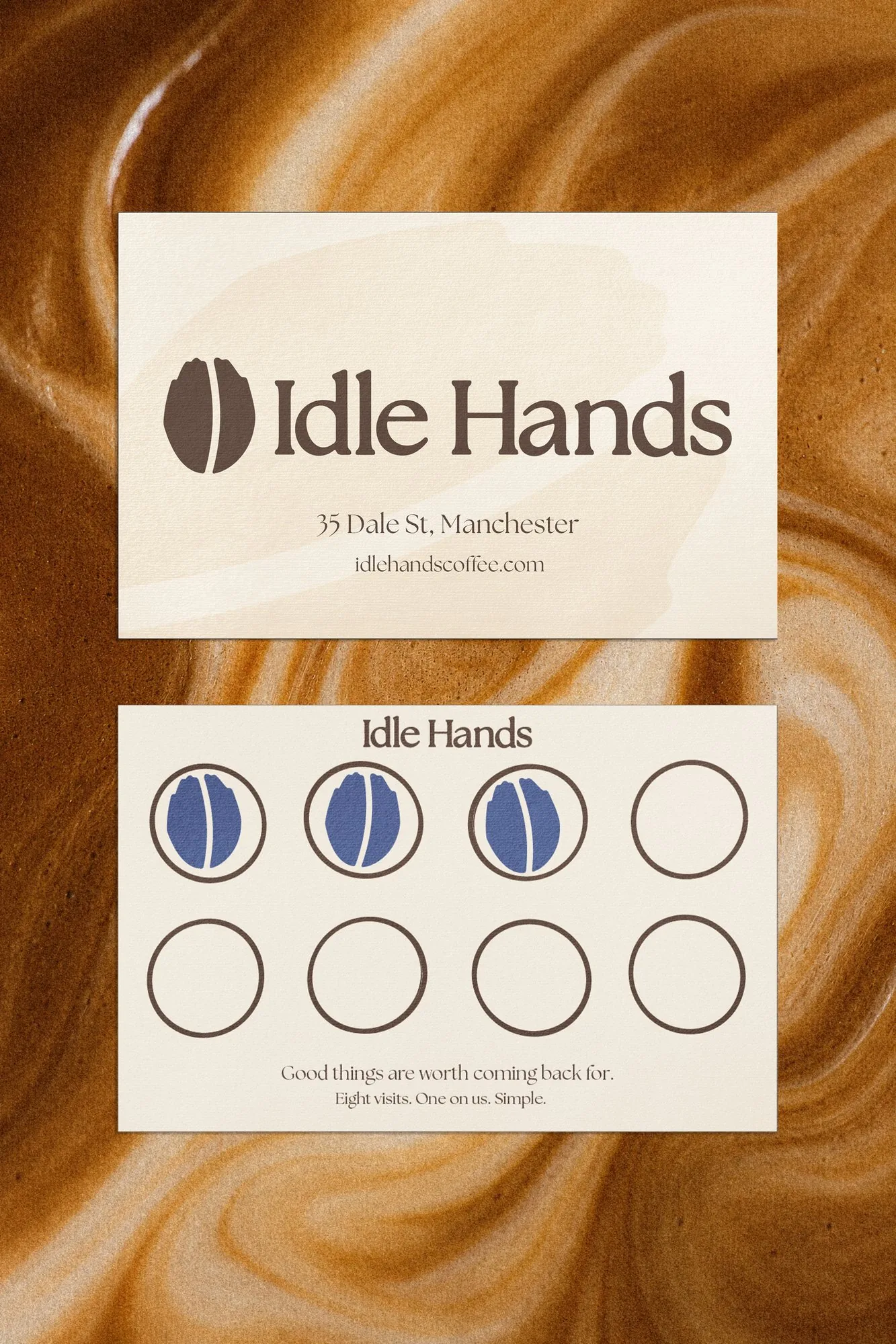
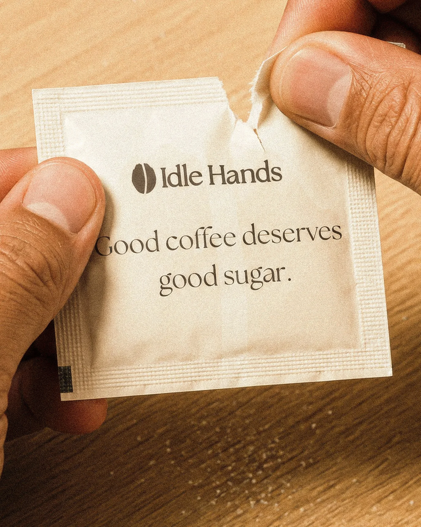
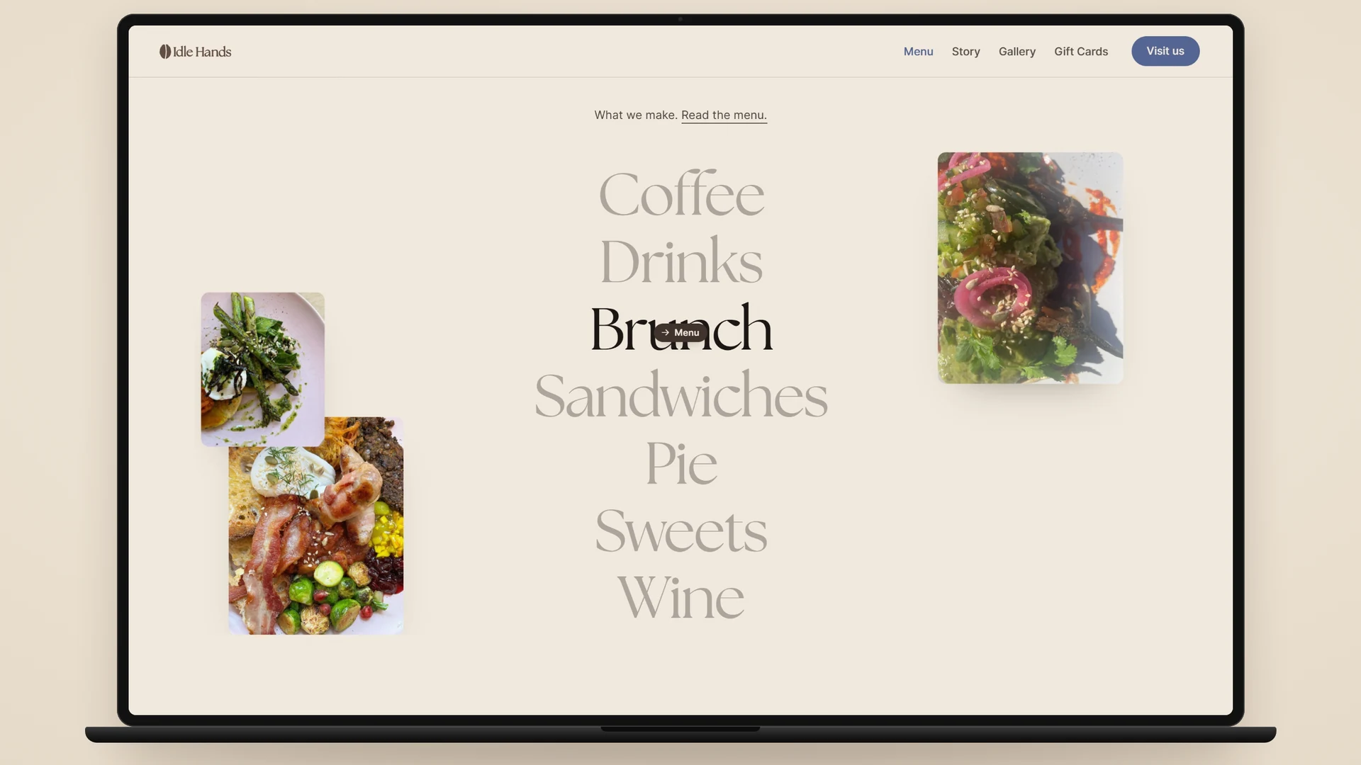
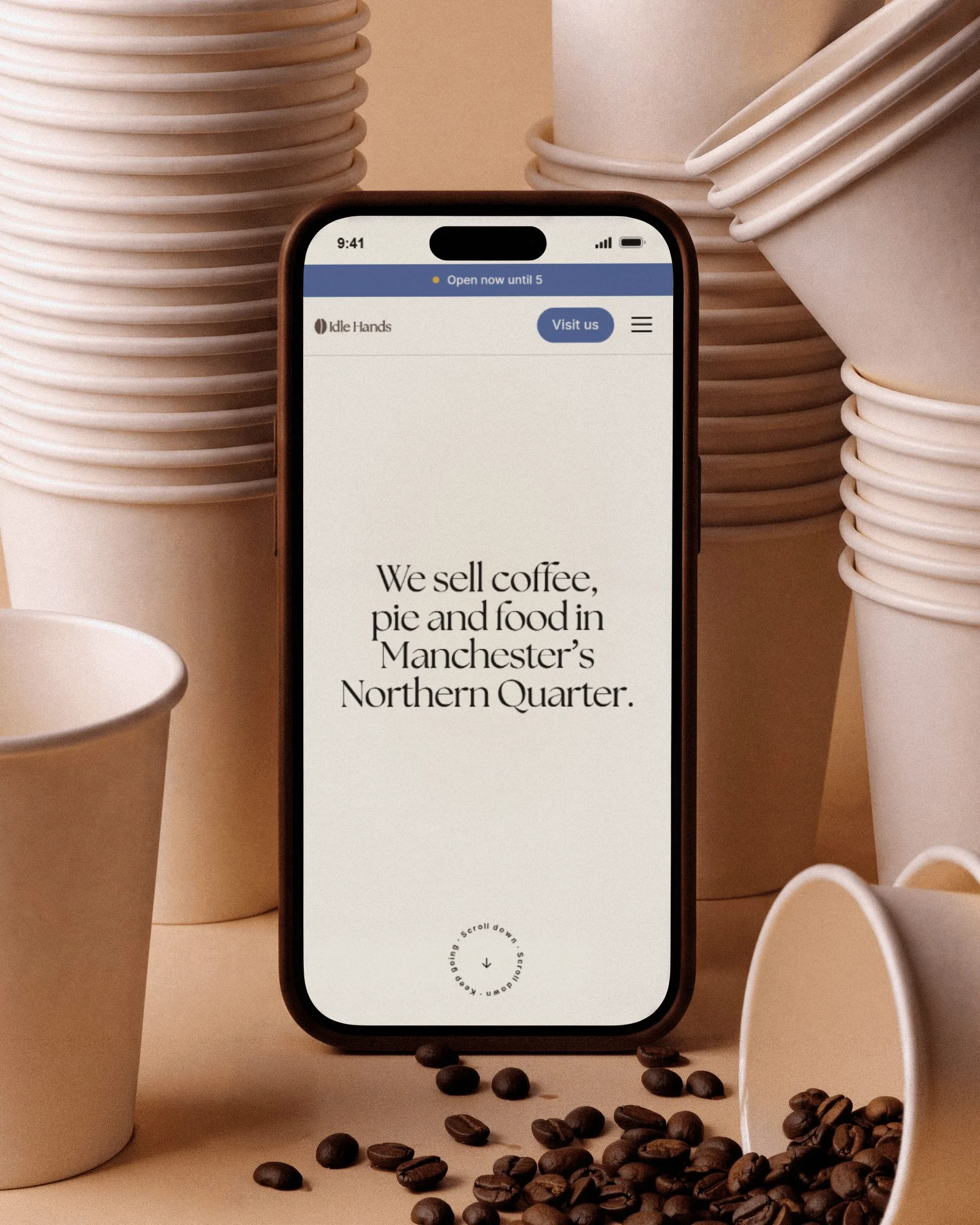
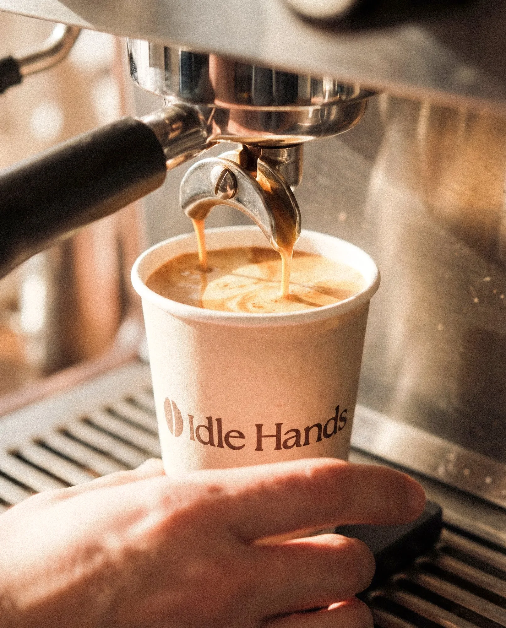
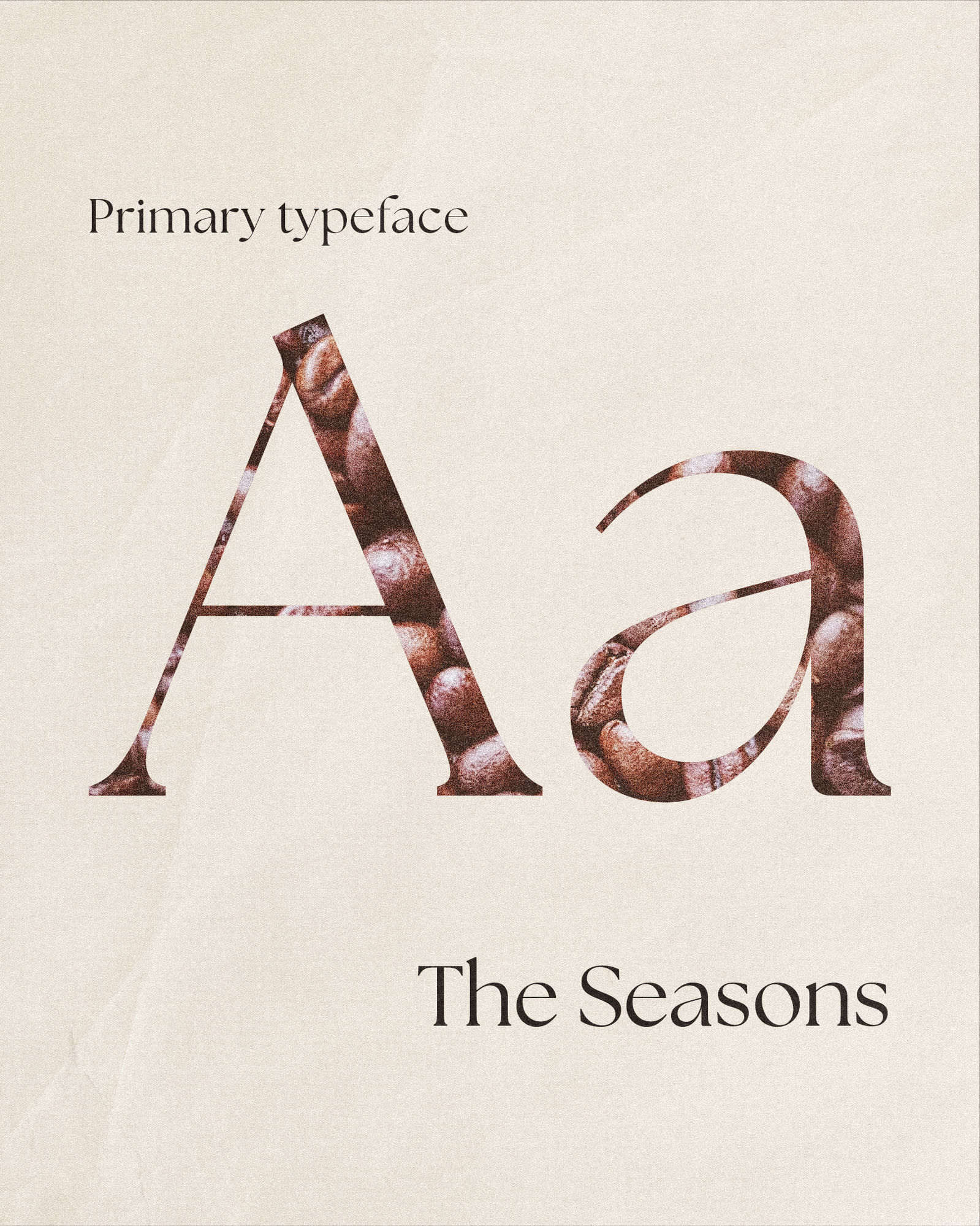
Everything starts with the mark: two cupped hands that resolve into a coffee bean. The care and the product, same object. It holds at 8mm on a sugar sachet and three feet up on a hanging sign. The Seasons leads, Inter does the quiet work underneath. Colours named after the menu, disciplined on the website and looser in the shop.
The site does what the shop does: the coffee and the pie get the space, and there's nothing between you and the menu. And the voice stays where people meet it: “You've found the good stuff” on the A-board. Nothing here raises its voice. It doesn't have to.