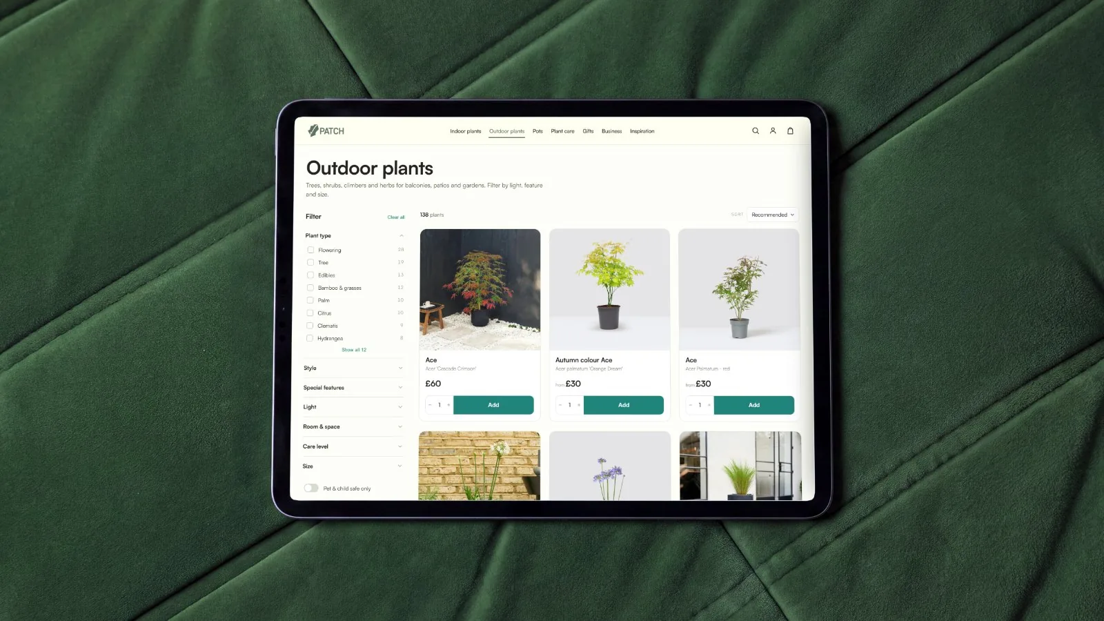
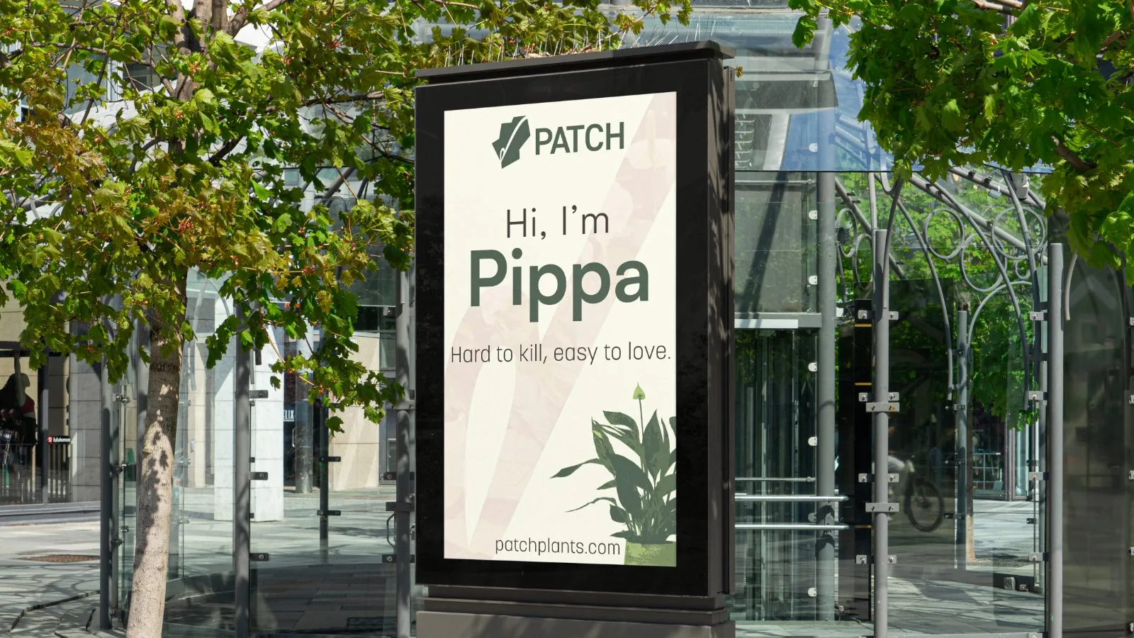
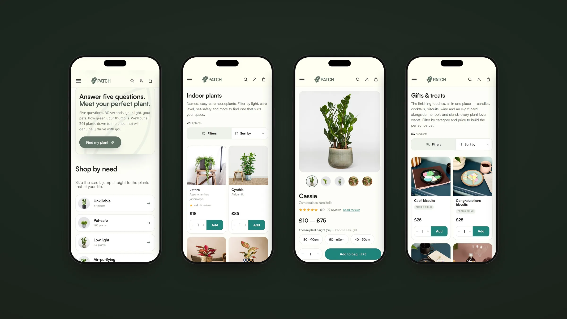
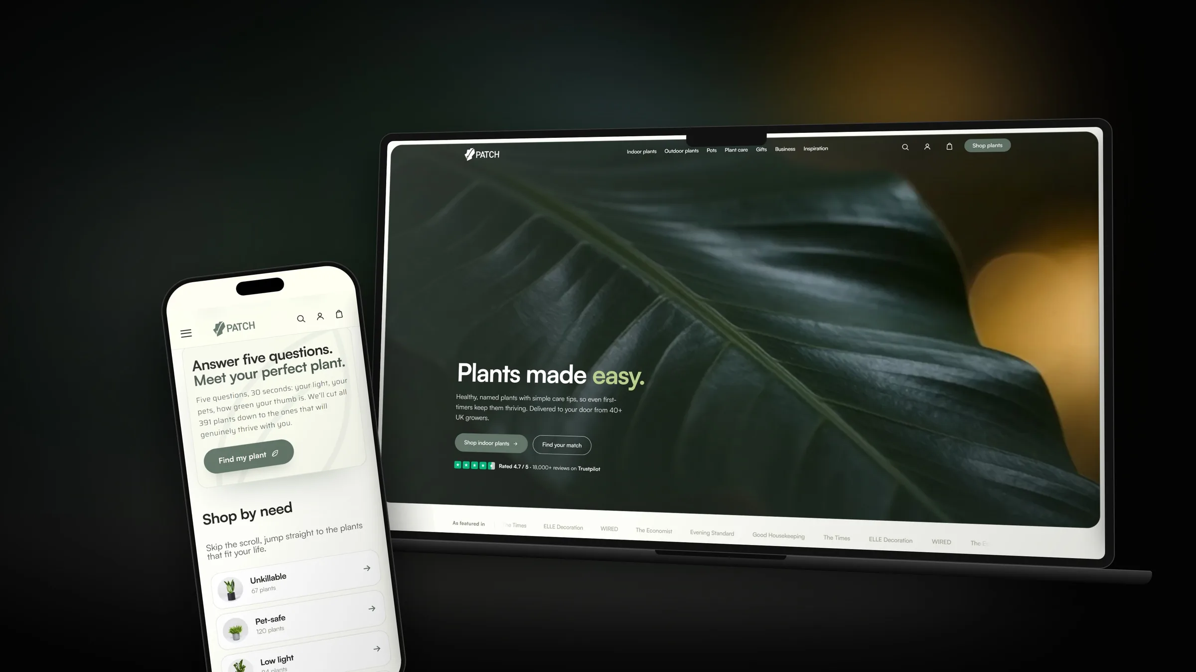
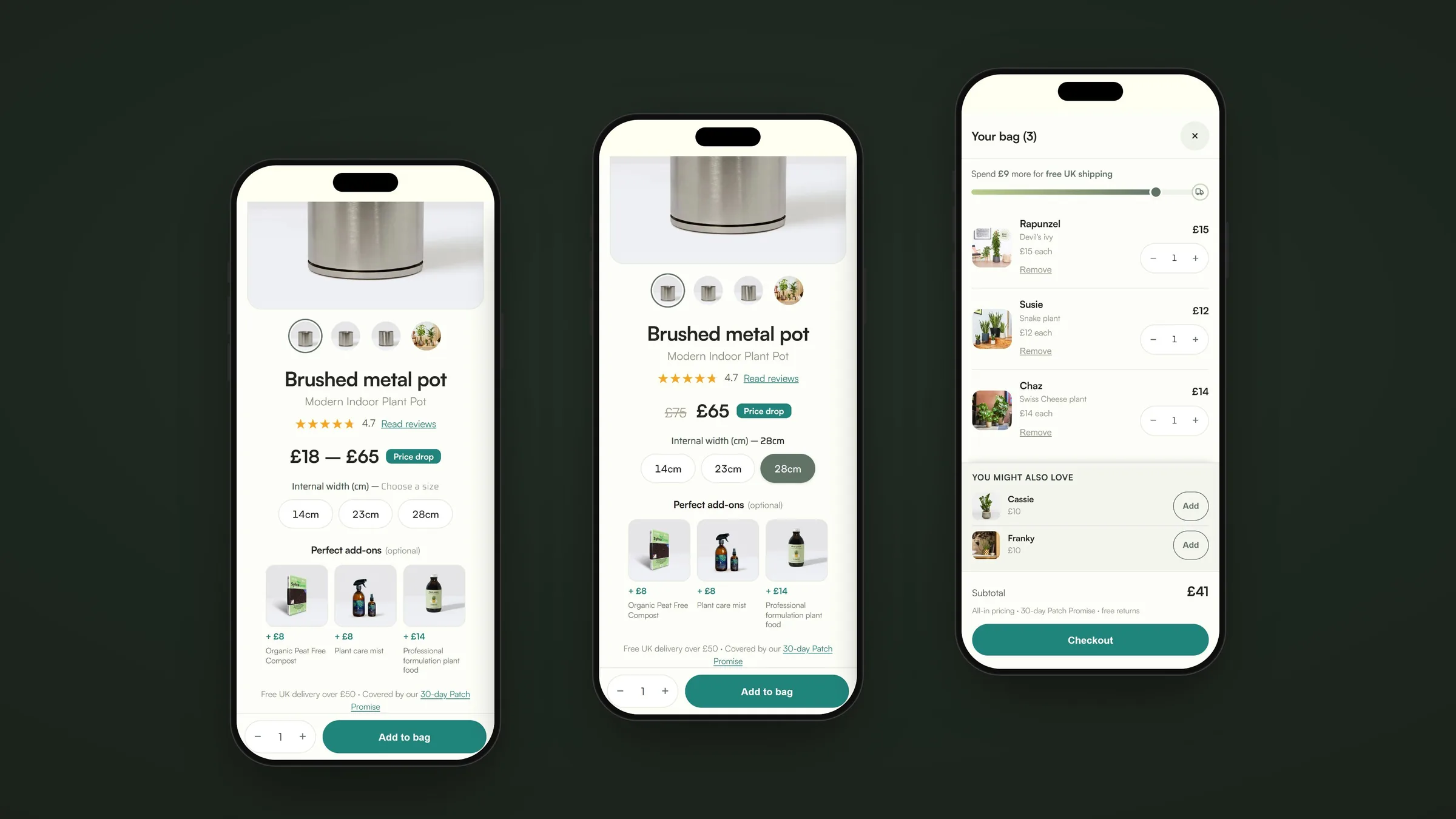
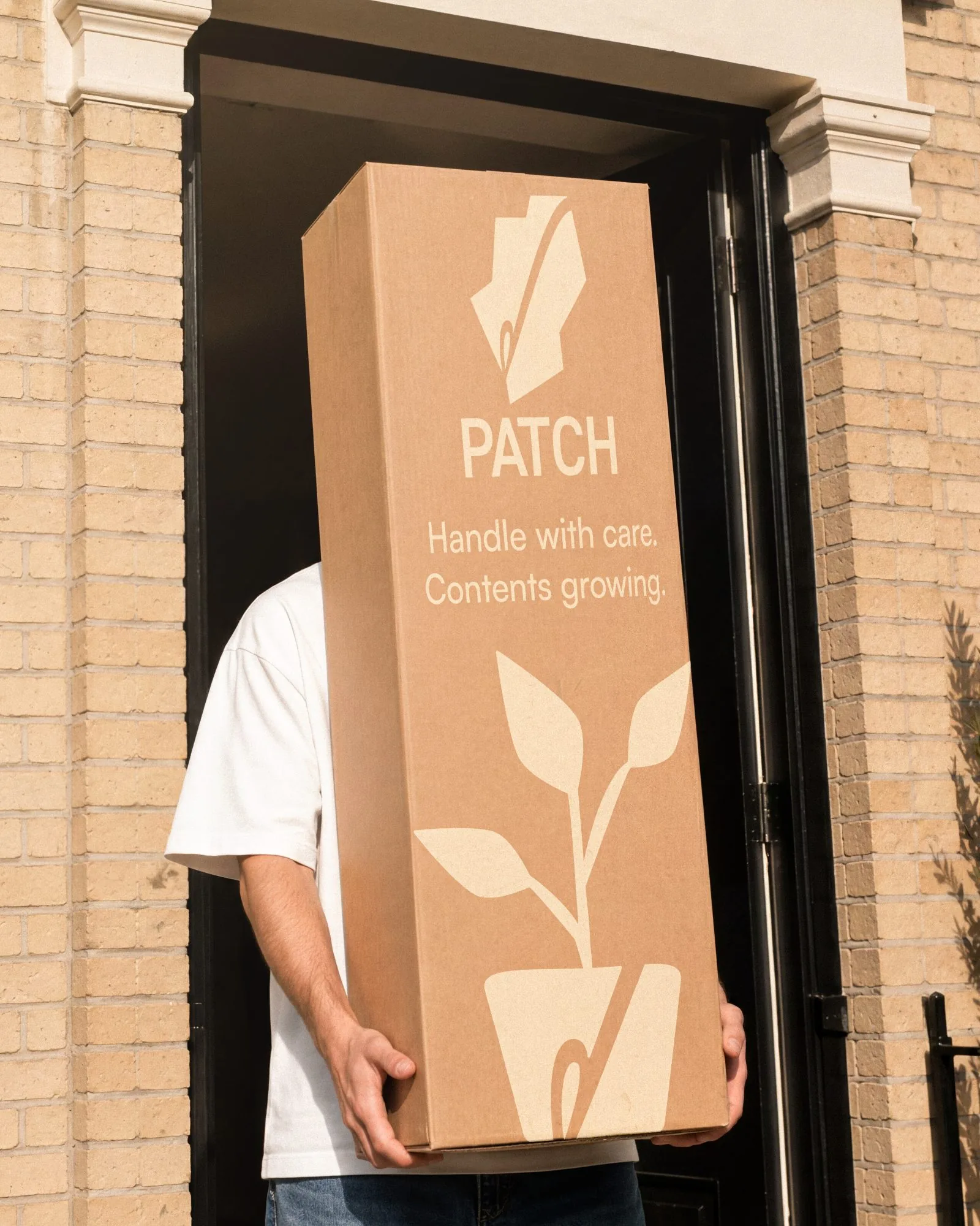
A concept rebrand and website for Patch, the plant delivery service that gives every plant a name. The idea genuinely works, but only in the product. The identity around it stayed generic, and the website cluttered. We rebuilt both around the personality: characterful where it counts, clean everywhere else.
- Sector
- Plant care
- Year
- 2026
- Scope
- Identity, web, packaging
- Status
- Conceptual study
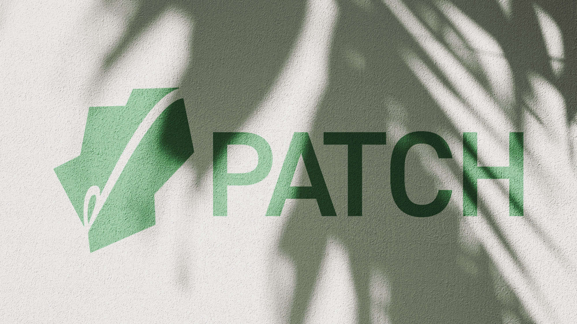

The mark.
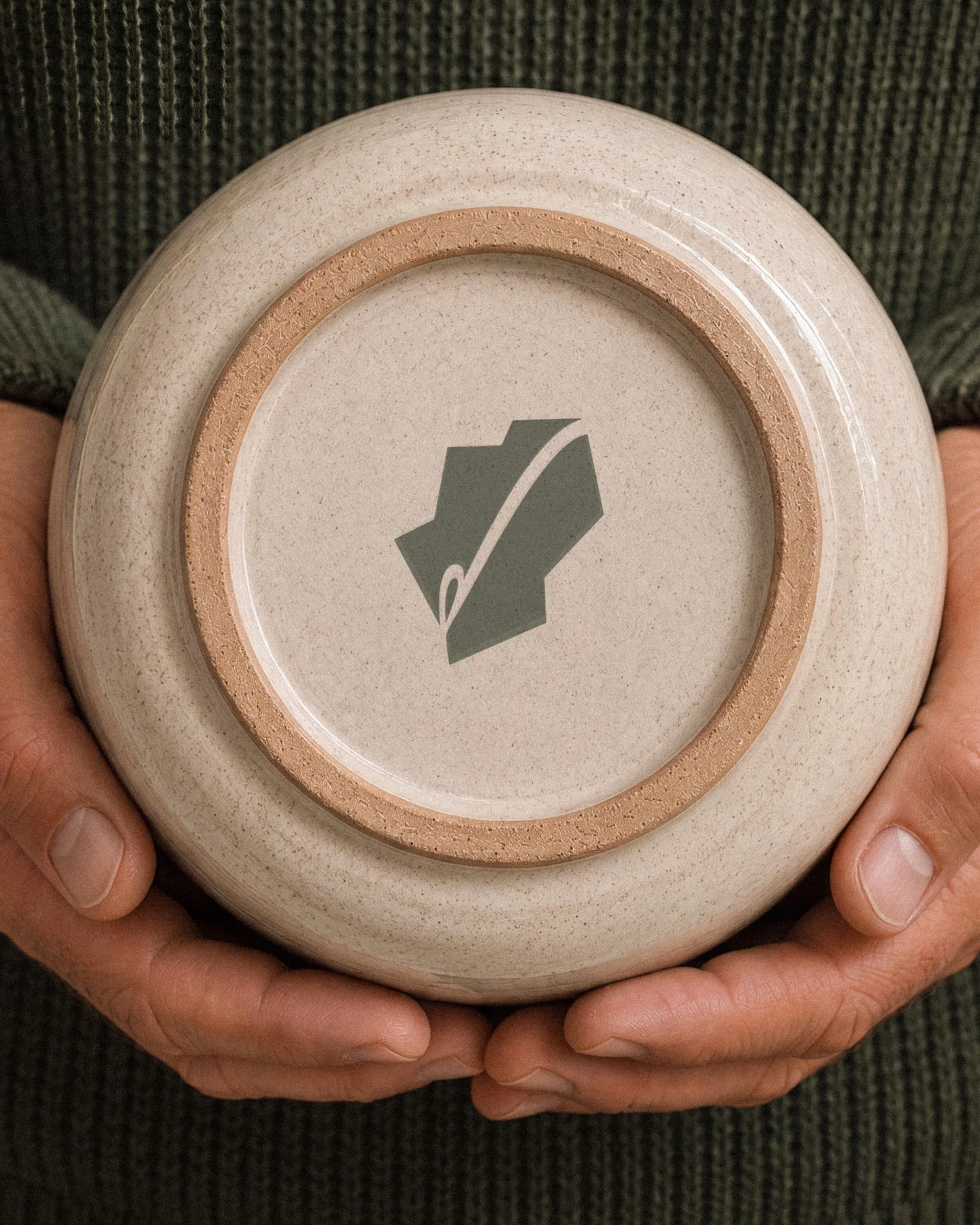
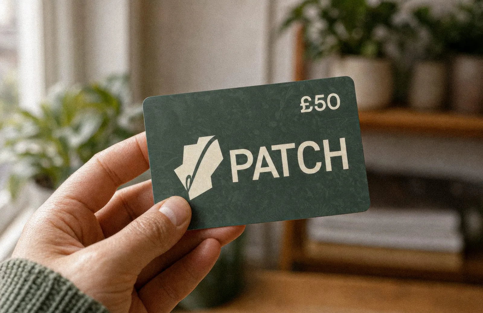
It started with a question: how do you put “plants you can trust” into one shape? A tick came first, quality and reliability in a single stroke, so we grew it into a leaf and built the letter P from its form. Then the loop gave us an idea: a needle and thread, stitched straight through the name. Patch, hiding in plain sight. A quiet nod to patching things up, including your track record with plants. Simple, recognisable, unmistakably Patch.
Why a refresh.
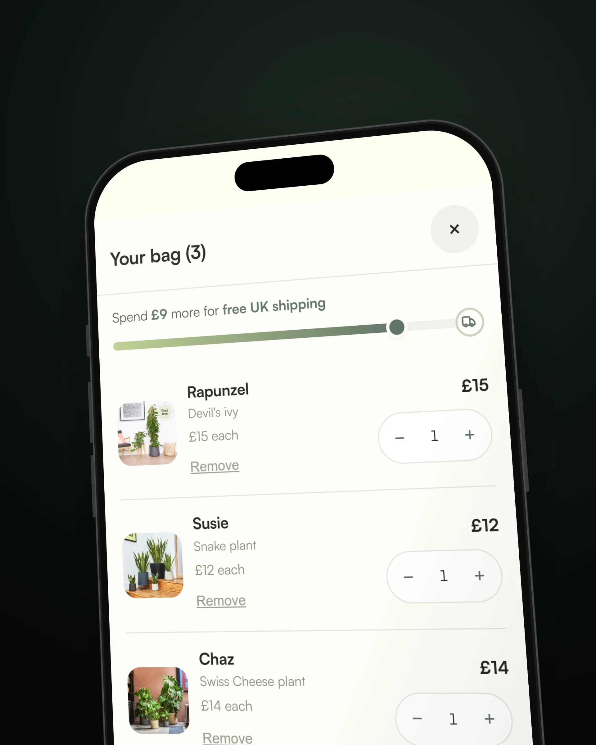
Patch already sells plants well, but in this self-initiated study we found three problems, all worth fixing. The website was cluttered. The identity was generic: a shallow logo, a sans, the same as every online plant shop. The thing people actually love, a plant with a name and a character of its own, lived in the copy and nowhere else.
The solution.
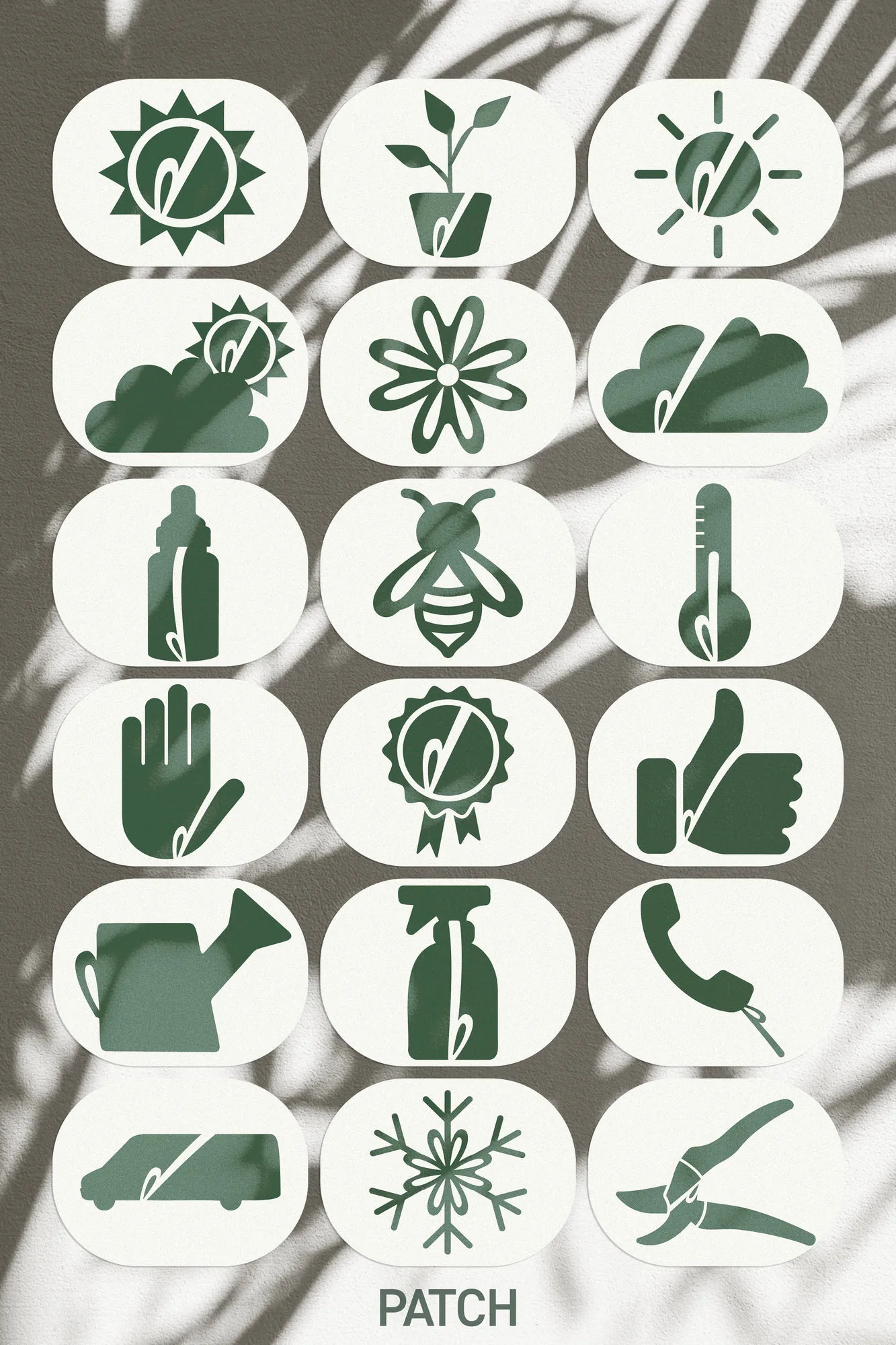
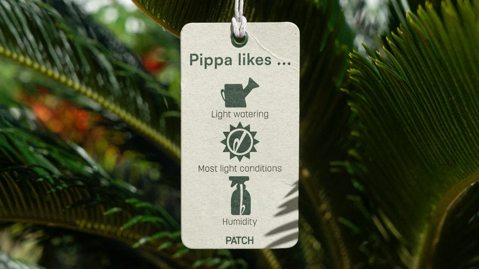
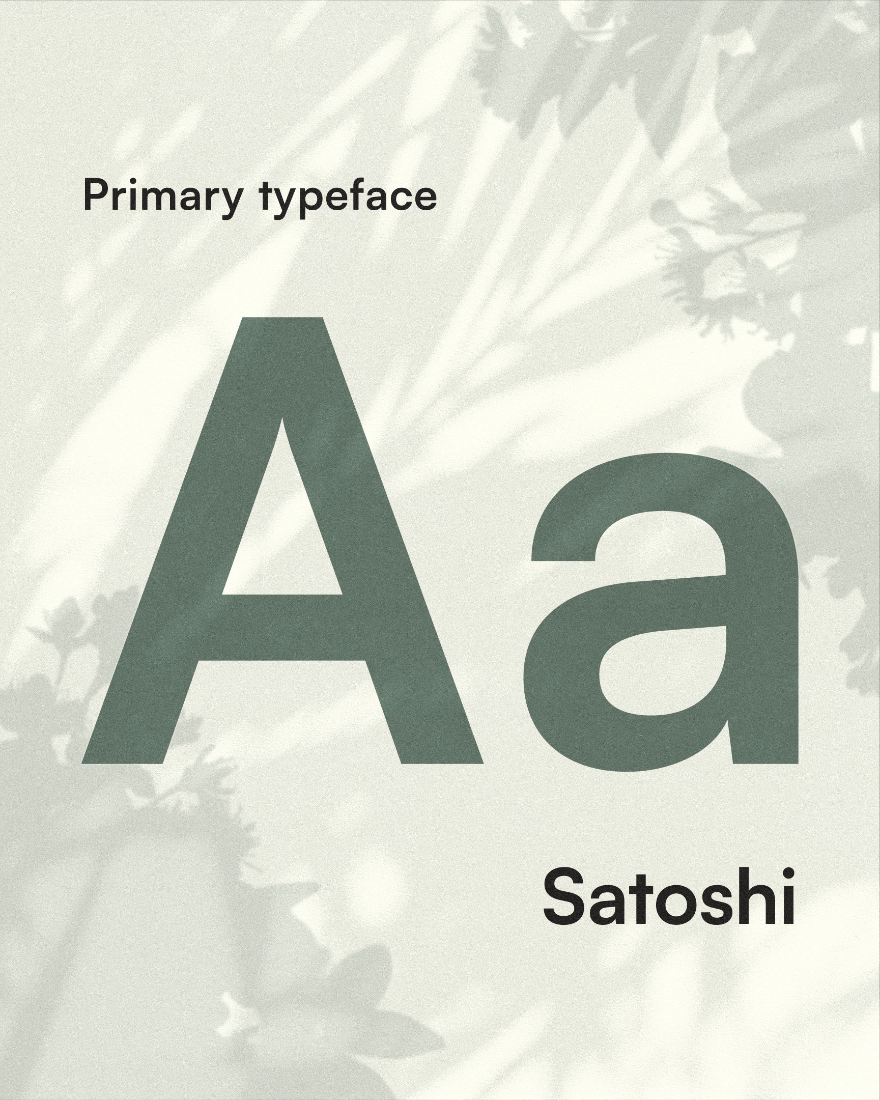
The site got stripped back and rebuilt on the new system, with the care icons doing the wayfinding and real hierarchy in the type, so it's faster to shop and easier to look at. The identity got specific: the stem from the mark running structurally through the icons, a palette of cream, sage and near-black with dusty pink held back for the moments that earn it, Satoshi on the headlines and Korolev keeping the body clean.
The character came out of the copy and onto the product. Every plant introduces itself now, by name on the pot and in its own individuality across all touch points. The store lets you shop that way too: by name and personality, not just species and size. Same plants, same idea Patch always had, just grown out of the pot that restricted it.