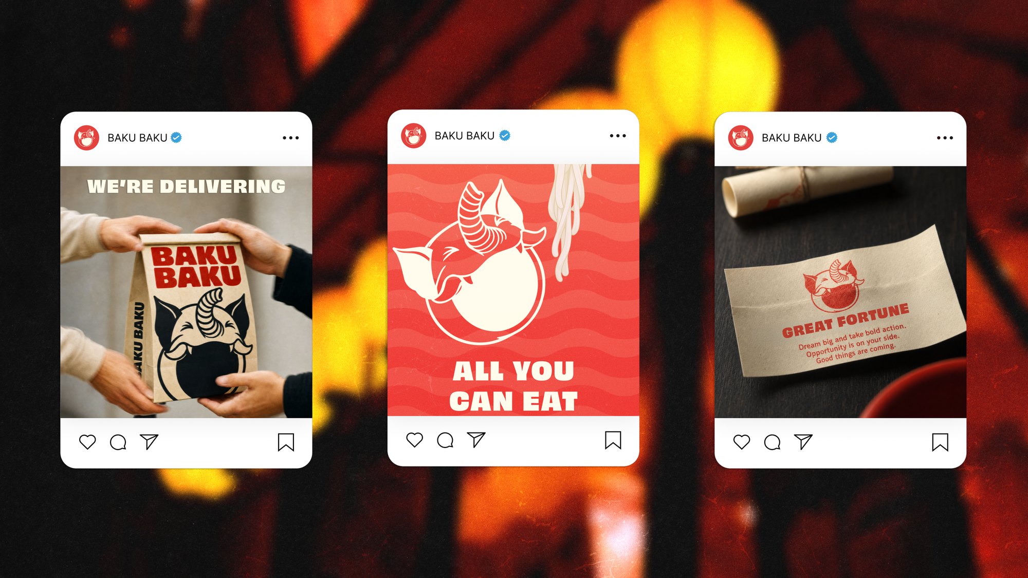
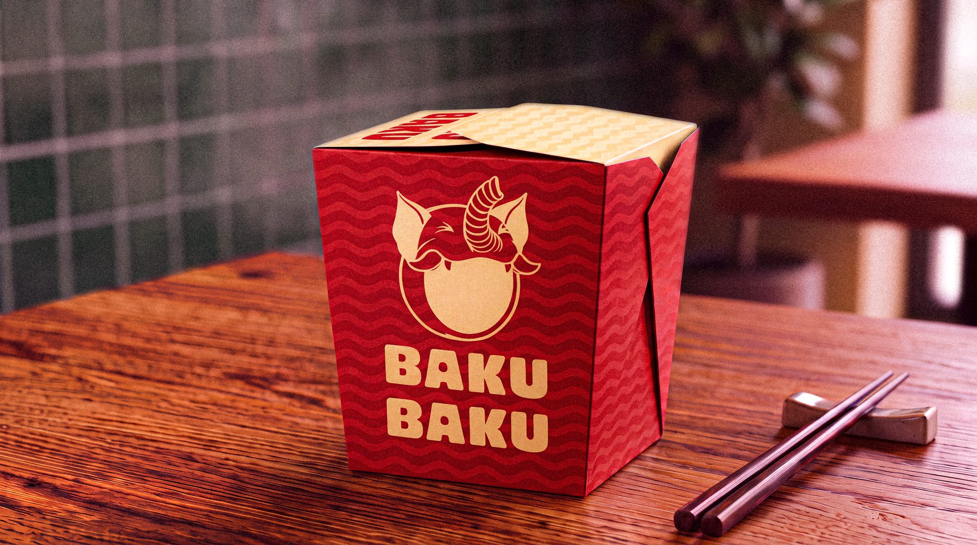
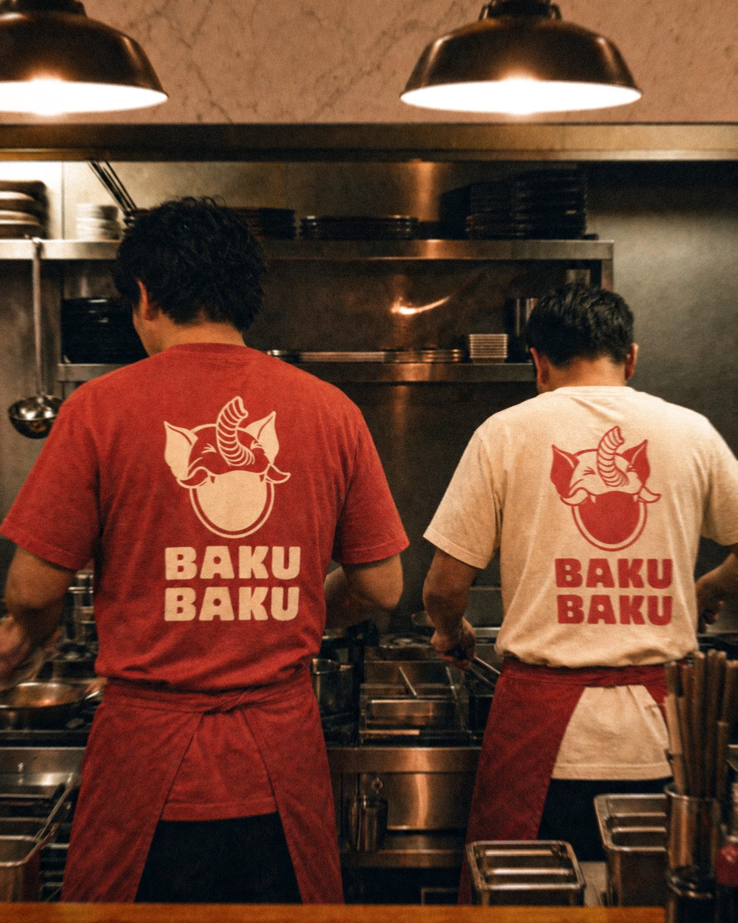
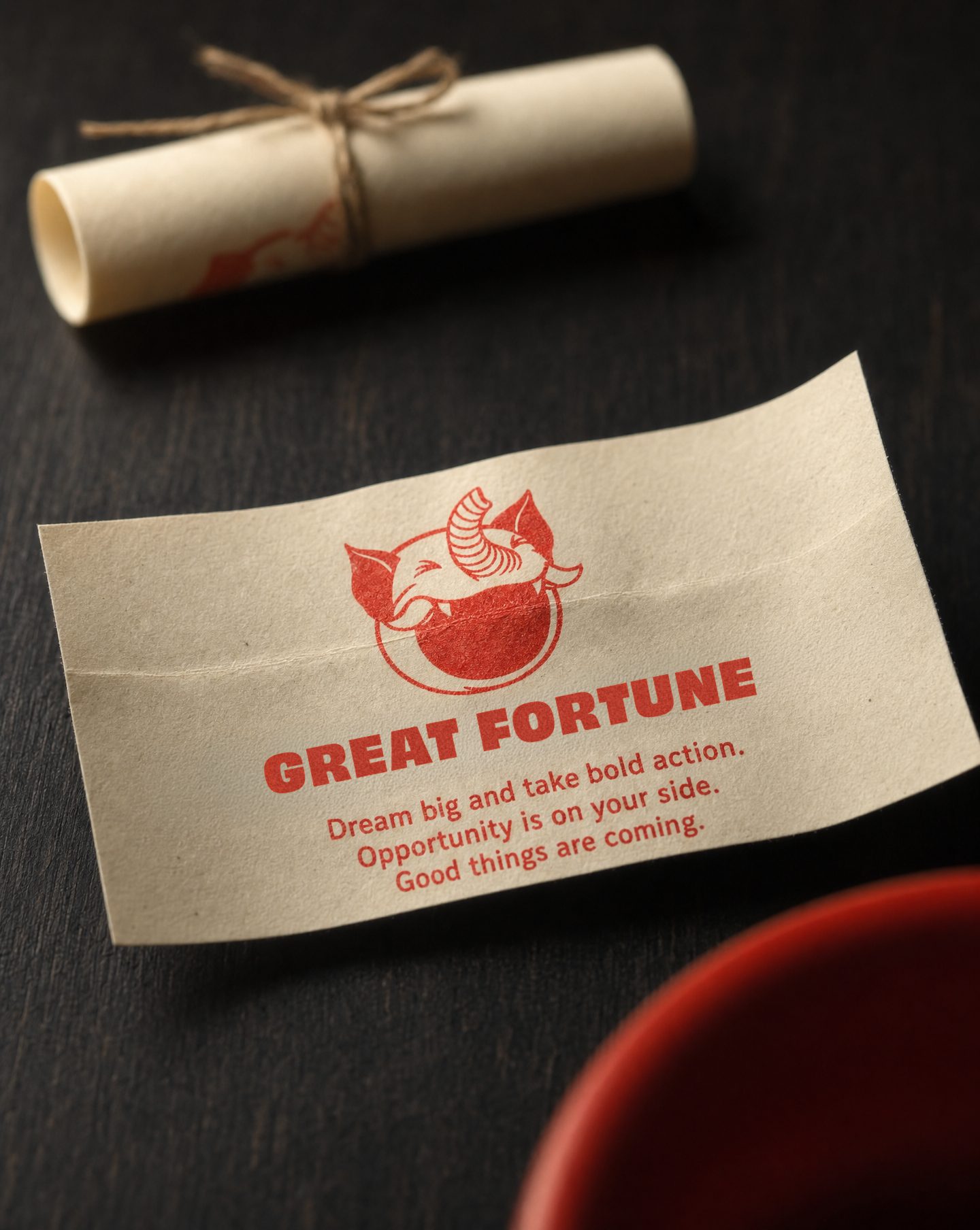
A concept identity for Baku Baku, a Manchester noodle bar with one job: fixing bad days. It takes its name from the Baku, the Japanese spirit that eats your nightmares, so we drew it eating for you. Every takeaway noodle joint reaches for the same lanterns and brushstrokes. We built this one around the mascot instead, and let it chomp its way onto everything from a fortune slip to the side of a lorry.
- Sector
- Food & restaurant
- Year
- 2026
- Scope
- Identity, packaging, campaign
- Status
- Conceptual study
The mark.
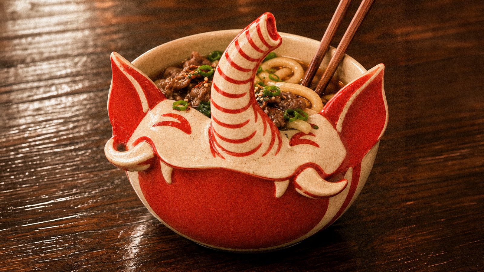
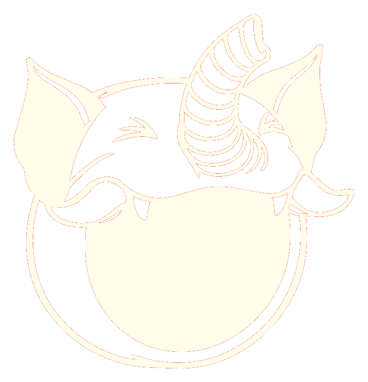
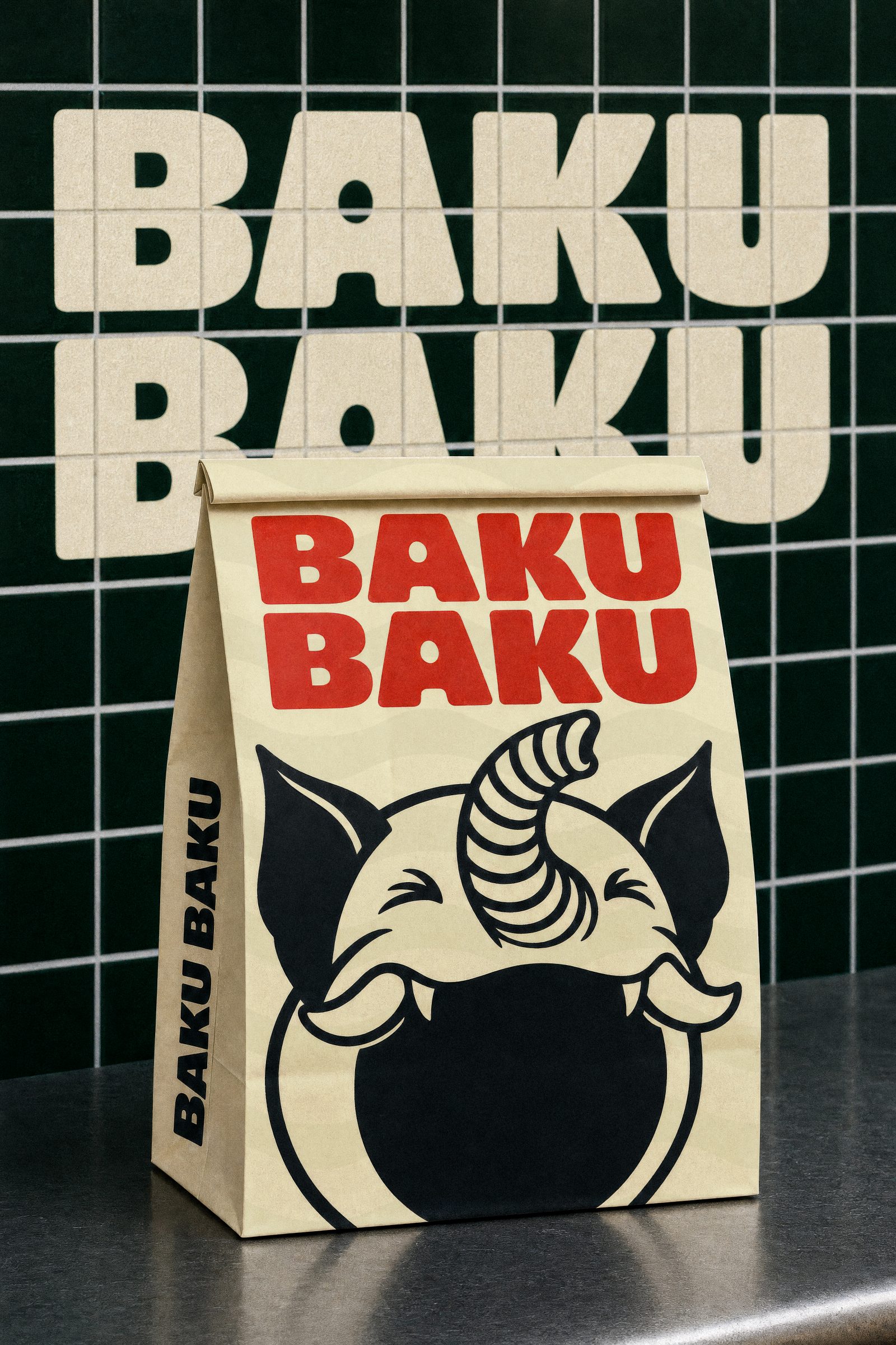
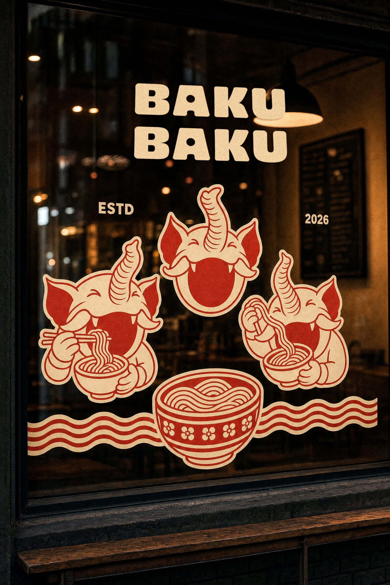
In Japanese folklore the Baku is the creature you call on to eat your bad dreams, so we gave it your bad days instead. Elephant's head, rhino ears, trunk up and a grin, drawn in one cream shape so it stamps cleanly on a bowl, a sticker or a shopfront. The circle underneath doubles as the bowl. The name is the sound it makes: baku baku, chomp chomp.
The idea.
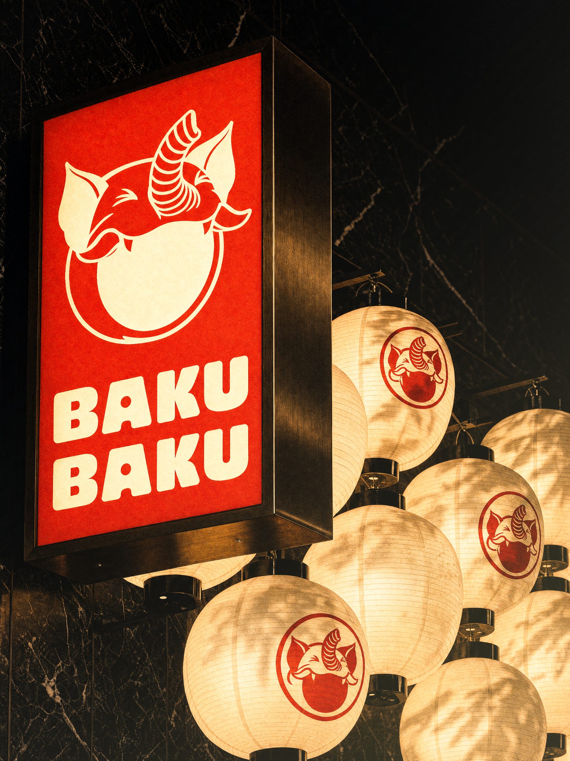
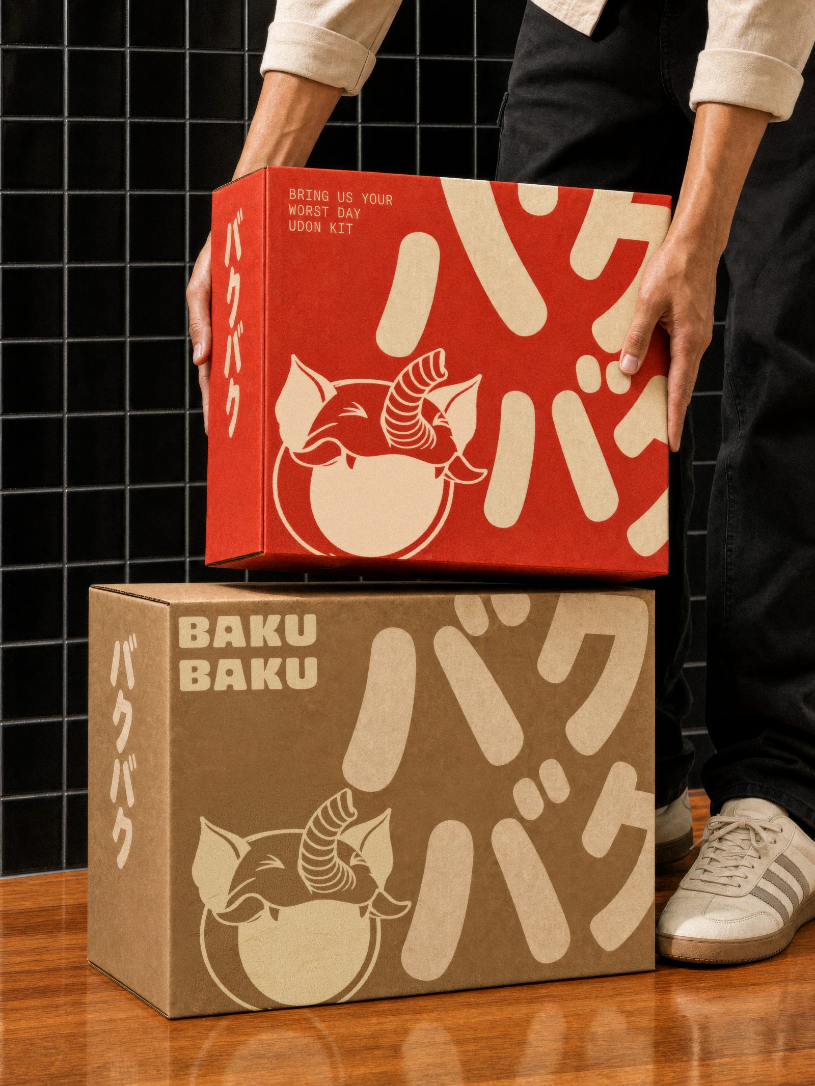
Baku Baku exists to fix bad days. Not a treat, not an occasion: the place you go when you need something to go right, with a bowl on the counter in six minutes and nobody asking why. So the brand is warm first and loud on purpose. Bigger portions, bolder flavours, a mascot that grins at you. Holding back has never cheered anyone up.
Built for one second.
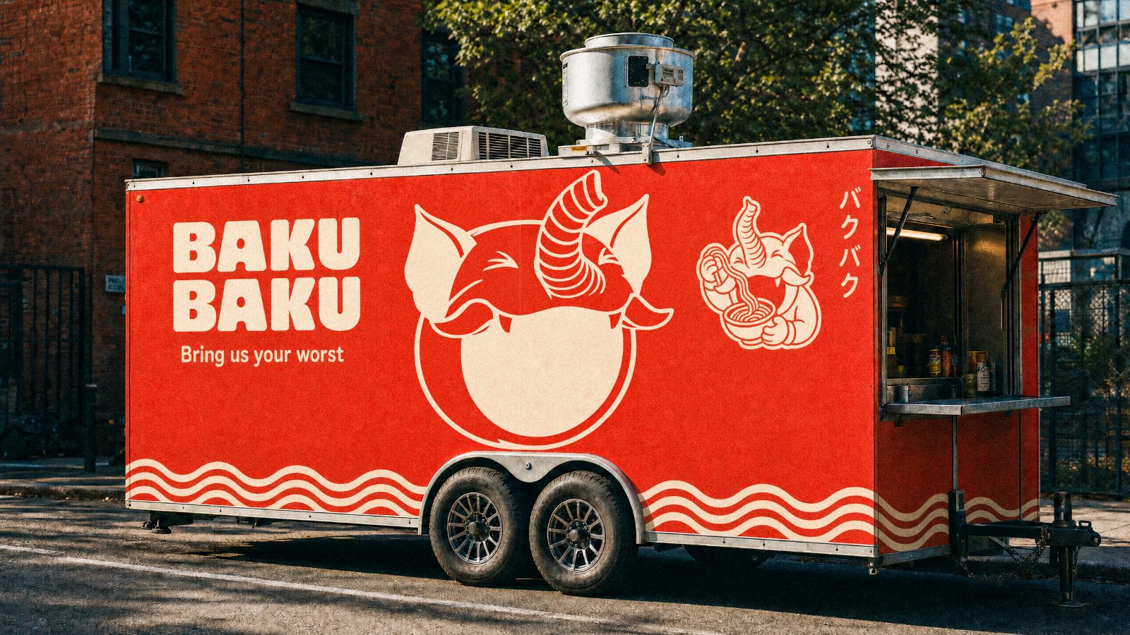
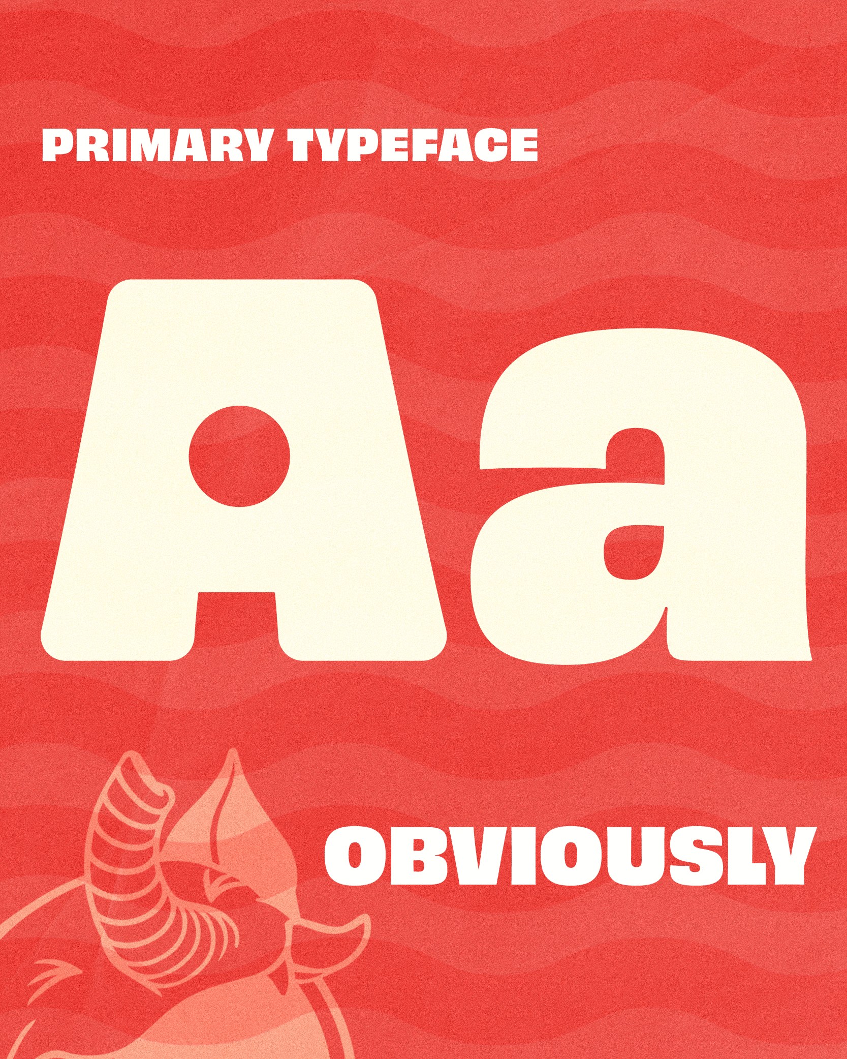
Nobody plans a trip to Baku Baku. You catch it from the bus, through the rain, on the worst day of the week, and it gets about a second to make its case. So the whole system is built for that second. Letters you can read at a jog. A wave that says the name even when the name is cropped off. Every surface is a shopfront, and the one thing it never does is ask you to lean in.