A concept identity for Idle Hands, an independent coffee house in Manchester that takes its time: thoughtfully sourced coffee, freshly baked pies, and a room built for slowing down. The brand had to feel as considered as the cup. We built it from two ideas, a pair of cupped hands and a coffee bean, and carried that one shape across everything that crosses the counter.
- Sector
- Coffee & pies
- Year
- 2026
- Scope
- Identity, packaging
- Status
- Conceptual study
The mark.
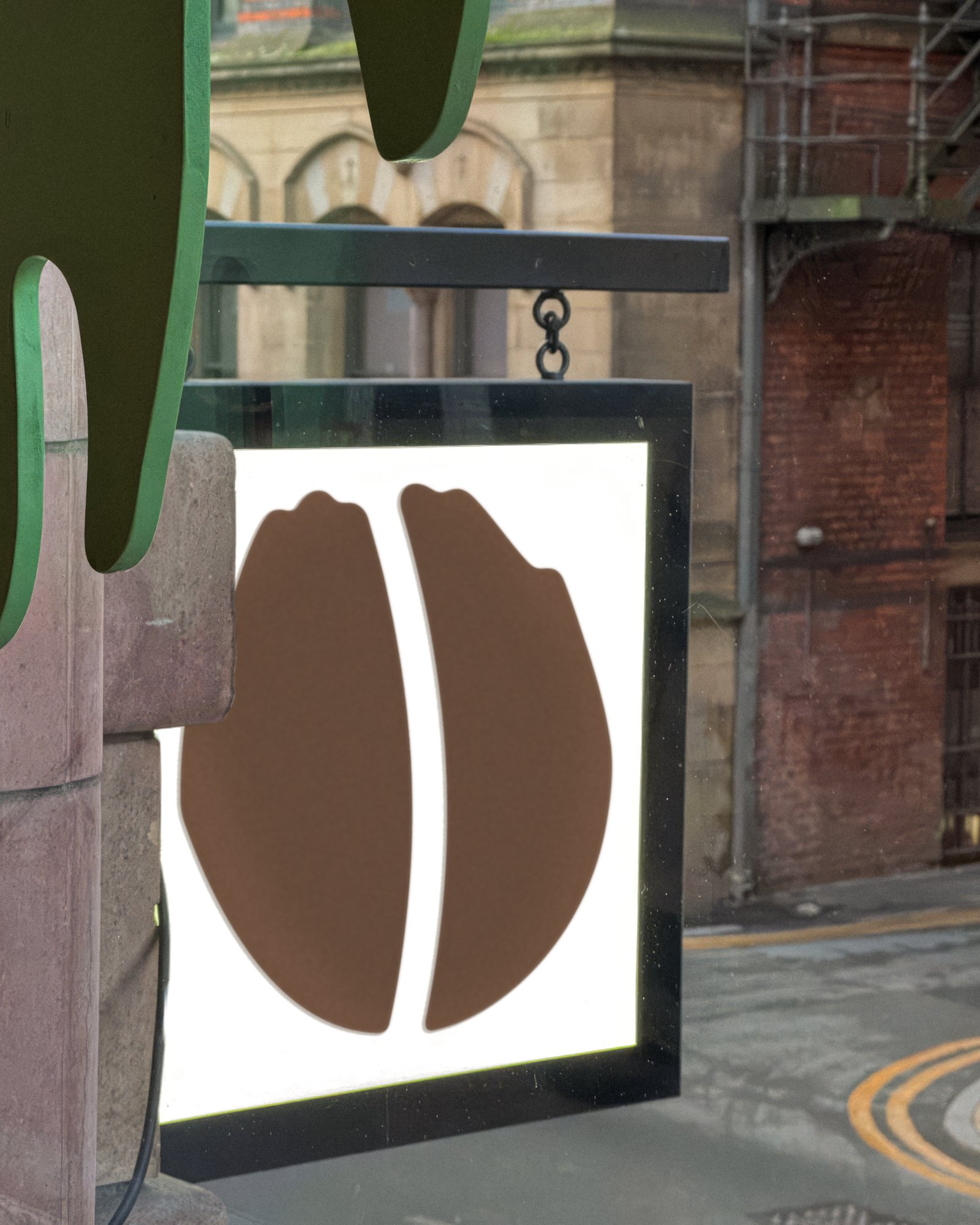
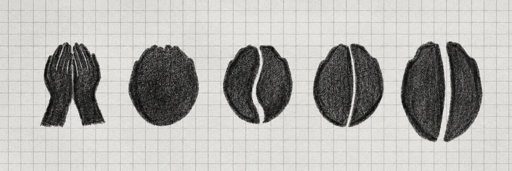
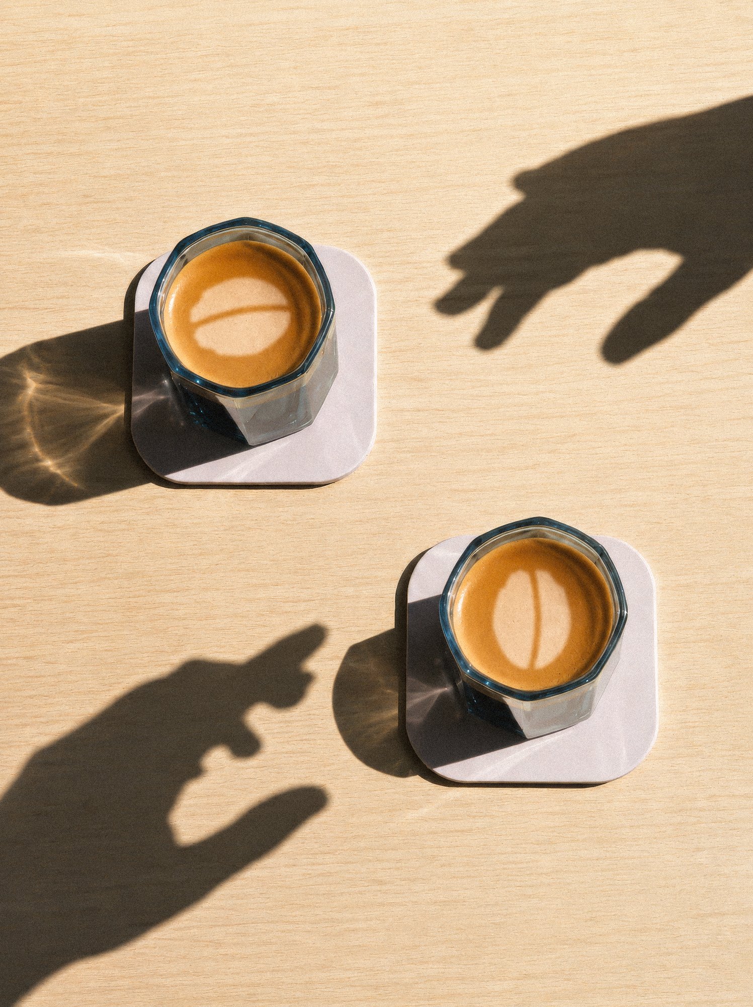
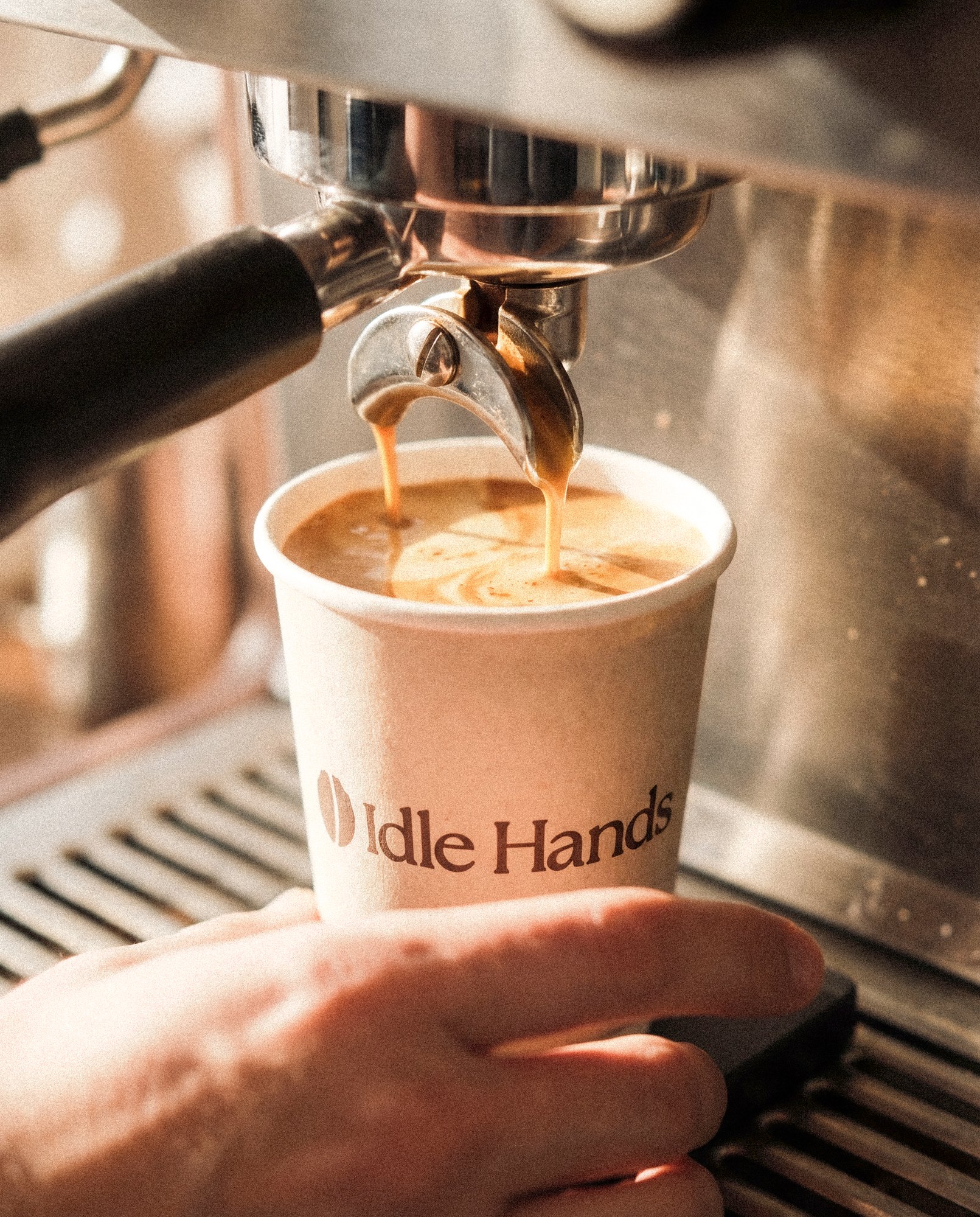
Two cupped hands, held together. Look again and they make a coffee bean. That is the whole idea: a welcome and the product in one shape, with nothing added. It stamps cleanly onto a pie bag, sits on a mug at any size, and reads from across the street on the sign over the door. The sketches show the route: hands, a circle, then the split.
The idea.
Idle Hands is built on a belief that the best moments happen when you slow down. Most independent coffee brands shout the opposite: bold type, loud colour, a lot of talk about origin. We wanted the identity to do what the café does. Say less, take its time, and get the details right.
Colour from the counter.
Five colours, each named after something on the menu. Idle Coffee and Condensed Milk do the daily work. Dark Cocoa, Blueberry Pie and Flat White step in for contrast and the odd surprise. Tap a swatch to read why.
A serif that takes its time.
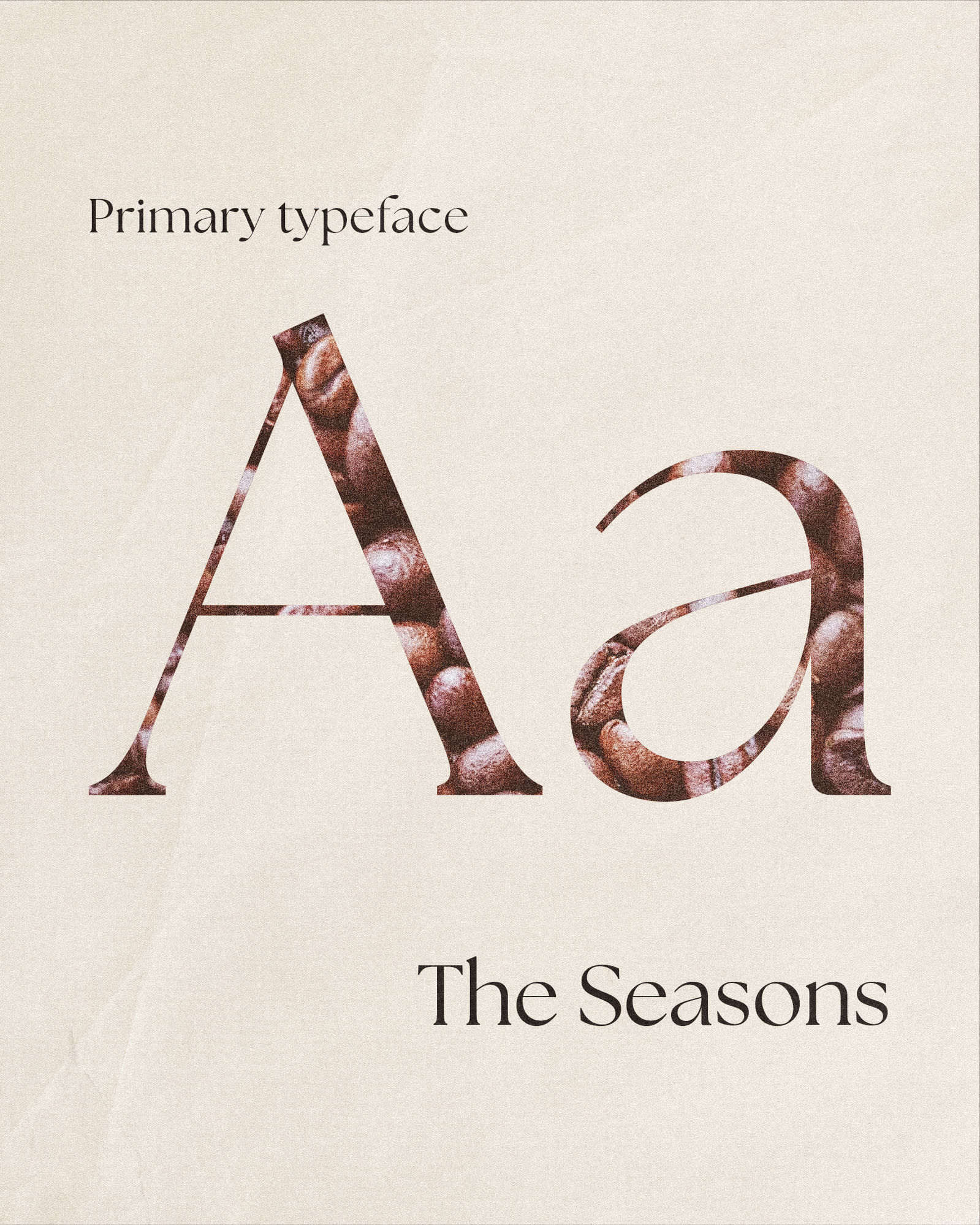
The Seasons leads: a warm, slightly old-fashioned serif with enough character to carry the wordmark and the sign. Inter does the quiet work underneath, on menus, labels and body copy, so the pairing stays calm and easy to read.
The challenge.
Independent coffee is a crowded room. Every shop in Manchester has a good roaster, a good playlist and a logo that looks like the one next door: a mug, a leaf, a bean, set in a friendly sans. The risk for Idle Hands was to blend into that wall, or to overcorrect and end up looking like a lifestyle brand instead of a place that makes good coffee and good pie.
So the identity had to be unmistakable at a glance and still feel handmade. A mark that works as a rubber stamp and as latte art. A palette taken from the cup, not a trend board. Type with enough warmth to say slow down without ever having to write it.
The pattern.
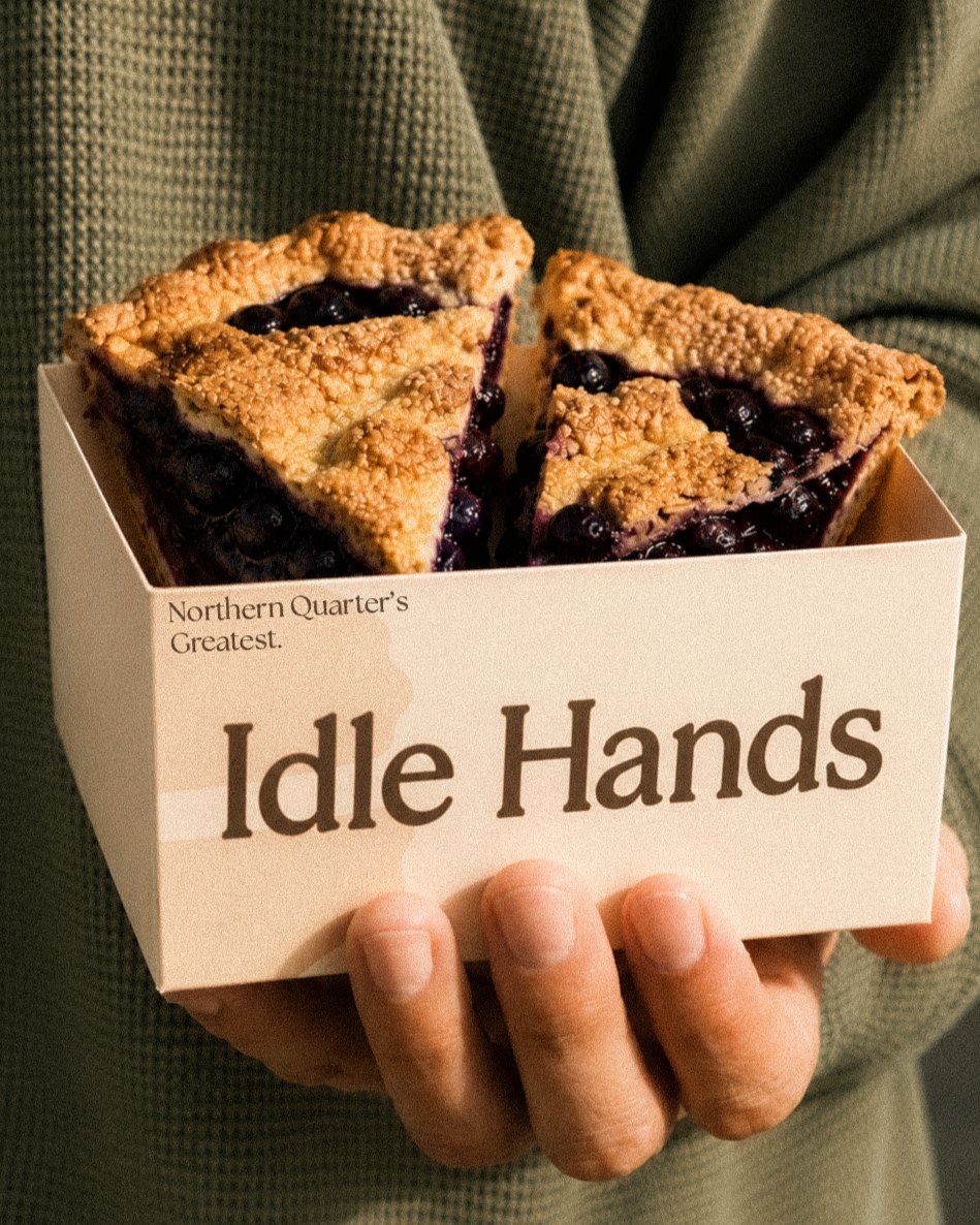
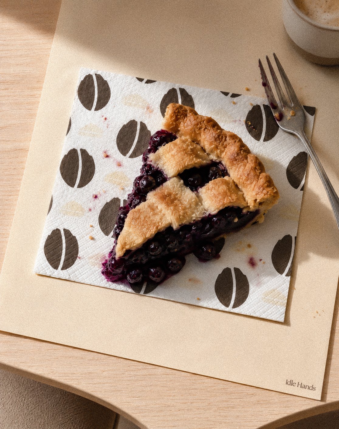
Beans and slices, repeated. Built from the two illustrations in the system, it wraps napkins and lines pie boxes, so the brand carries on after the sign has disappeared behind you.
Across the counter.
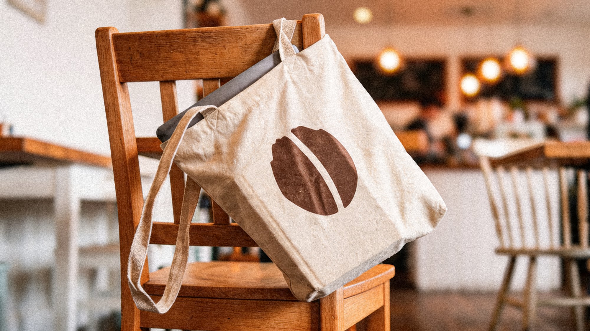
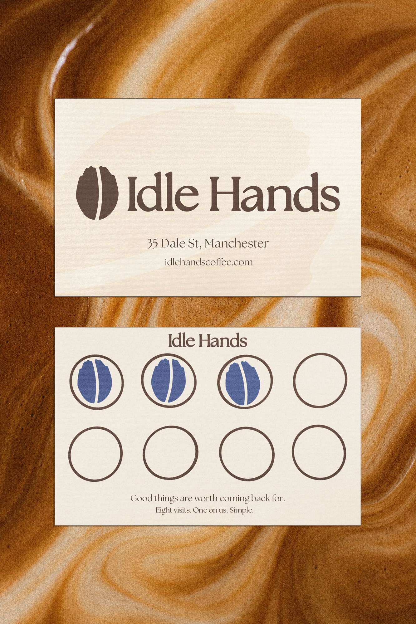
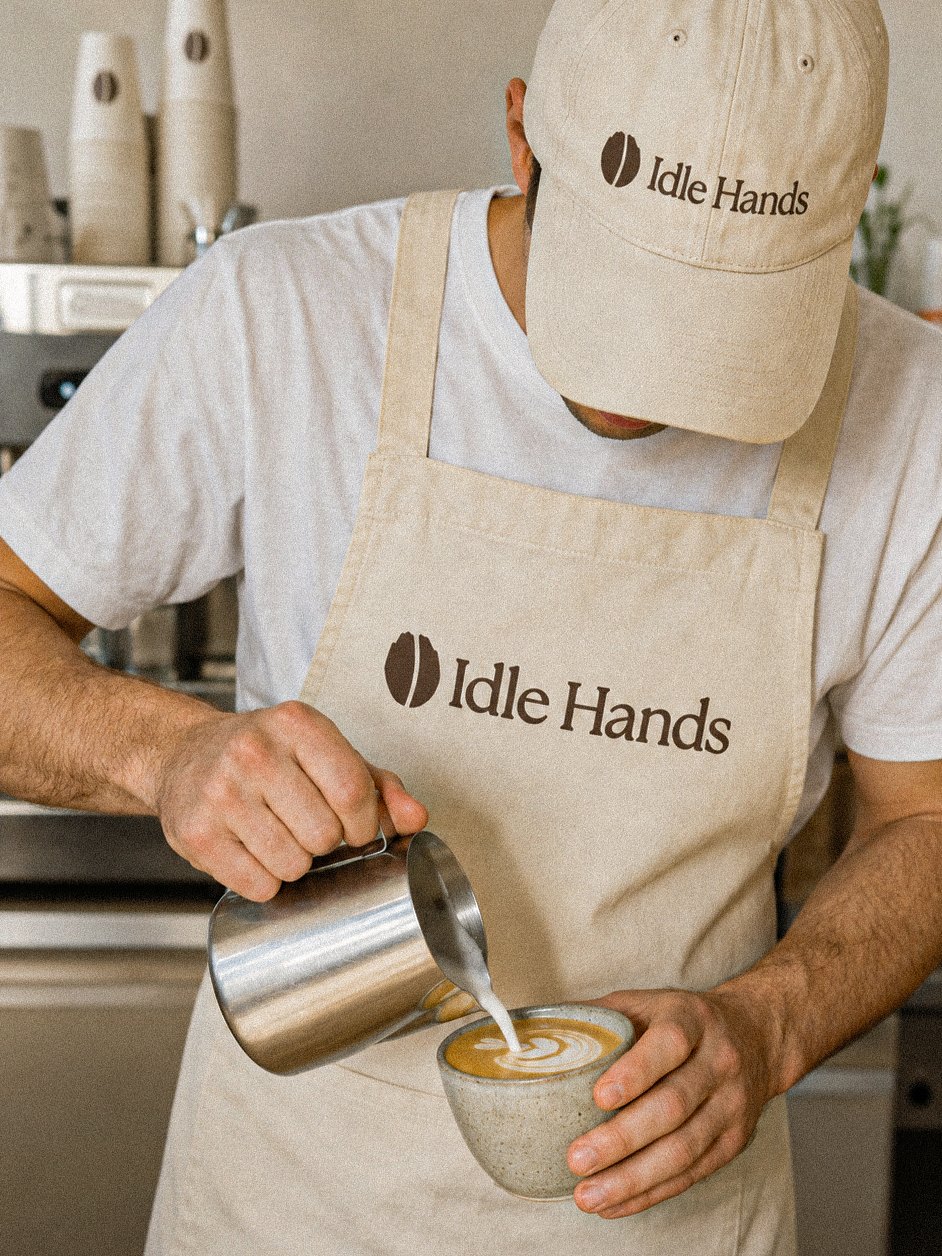
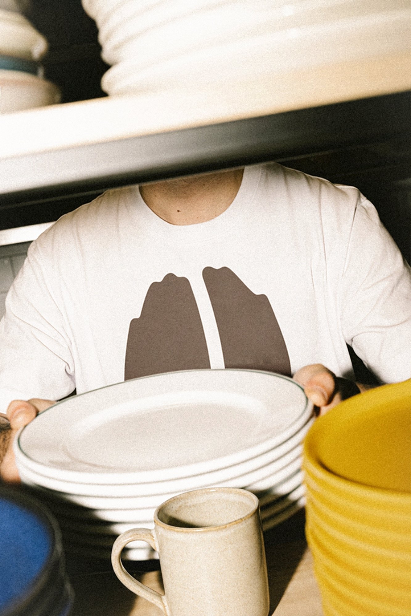
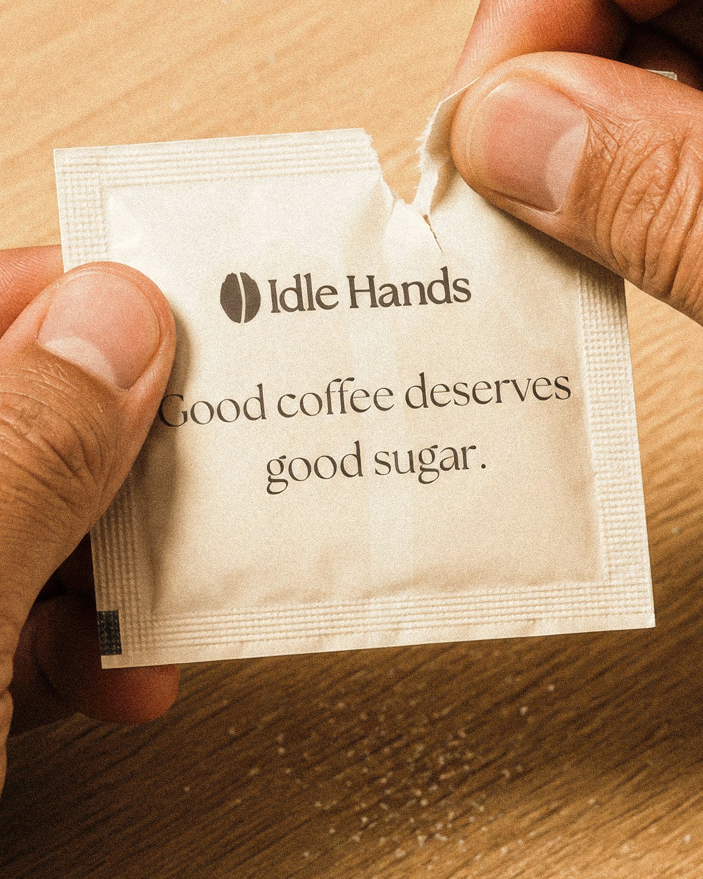
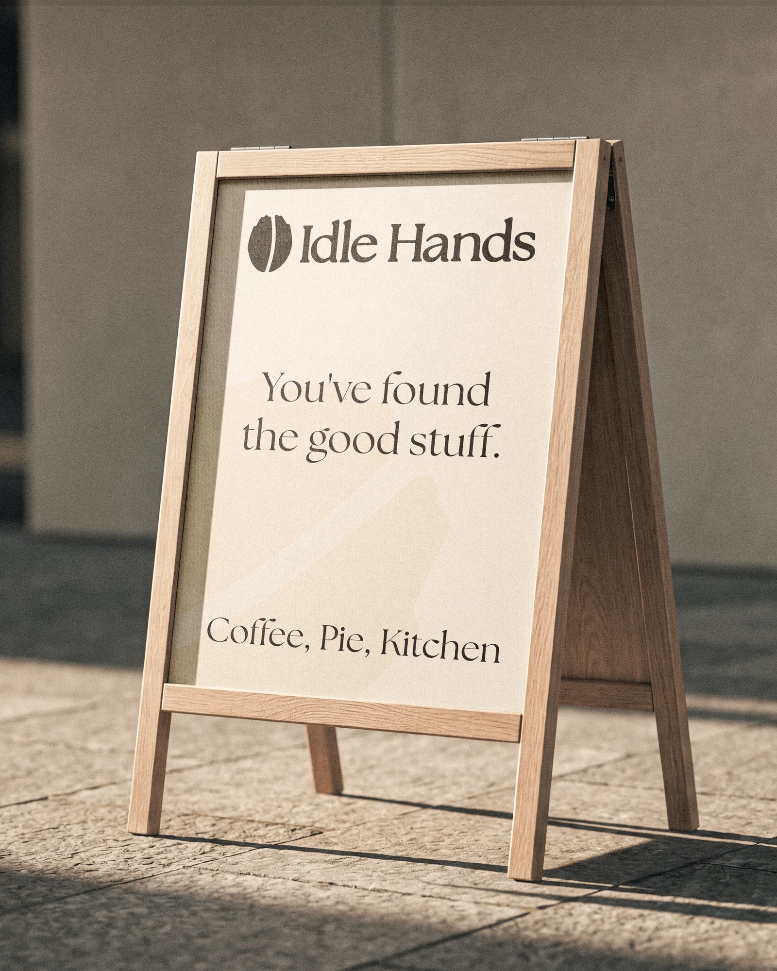
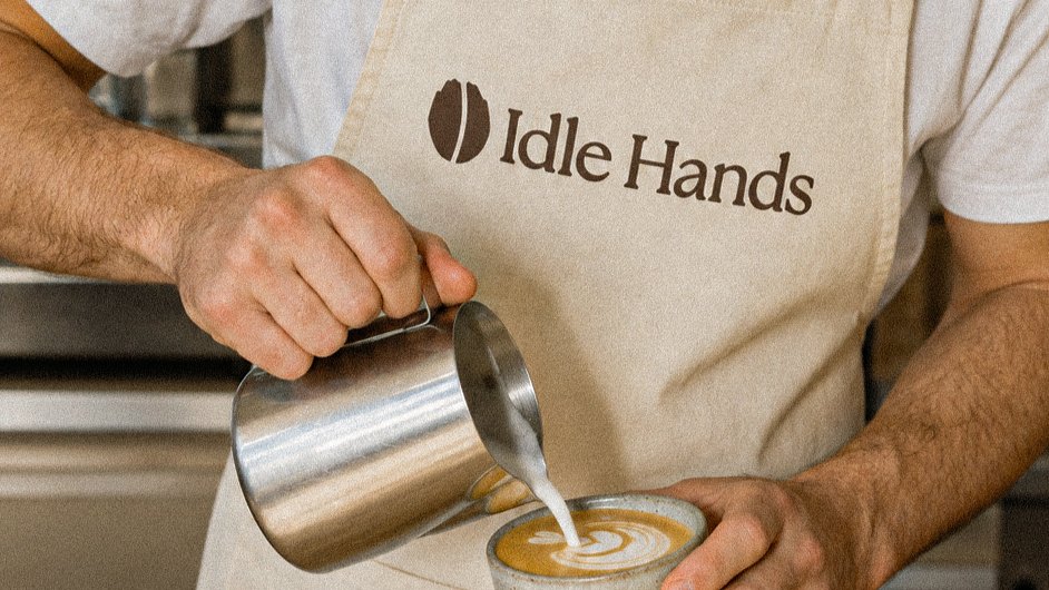
Cups, napkins, loyalty cards, gift cards, aprons and caps, tees, totes, a sugar sachet, the A-board and the sign. Everything a hand touches in the café carries the same bean, so the system is recognisable long after the coffee is gone.