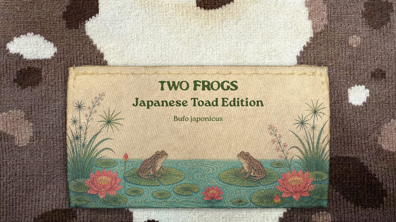
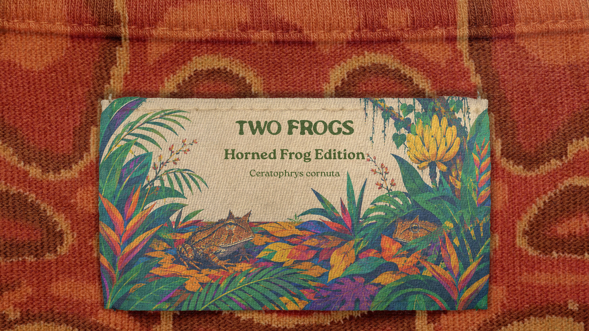
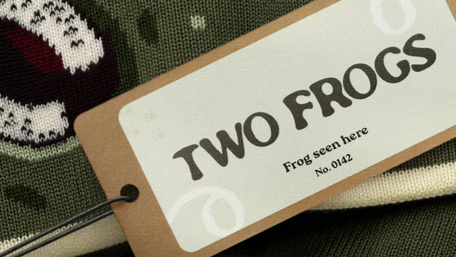
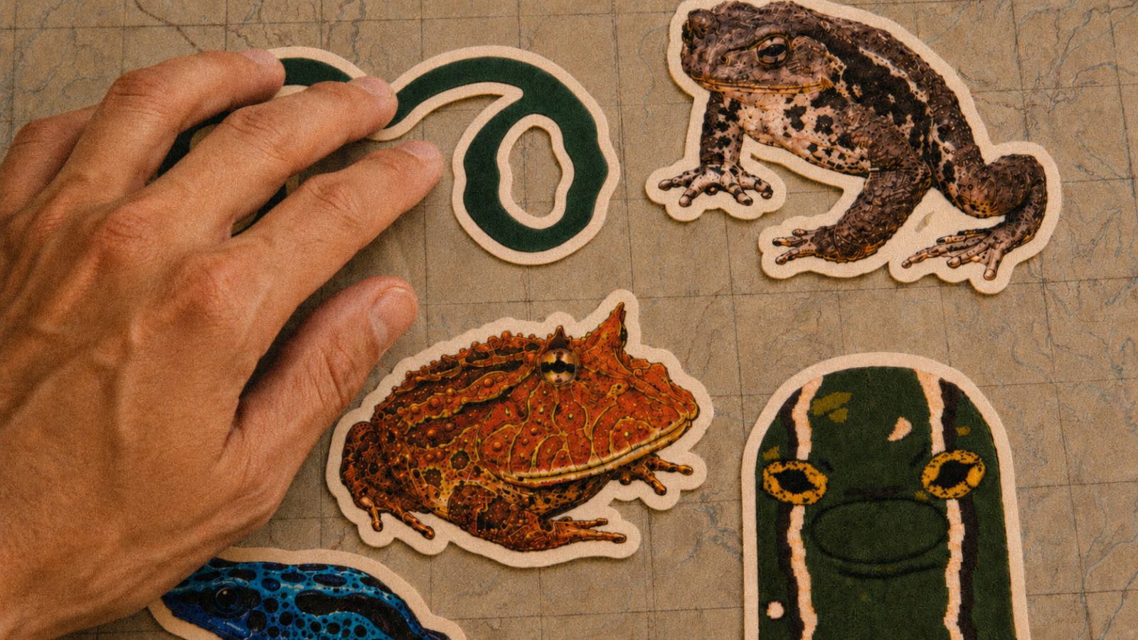
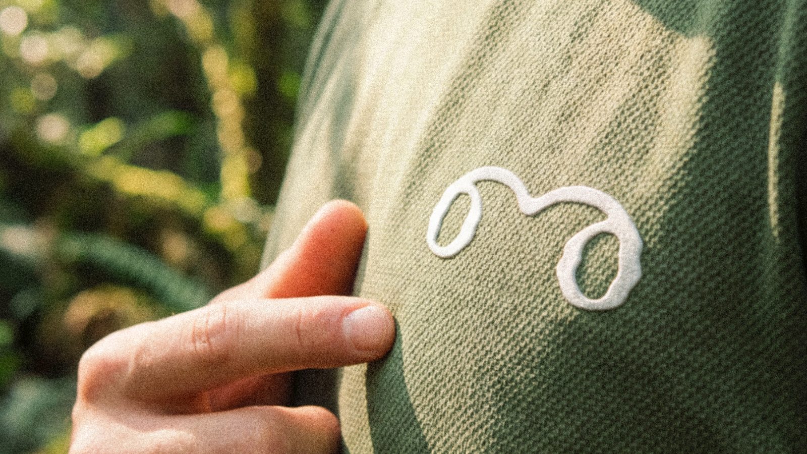
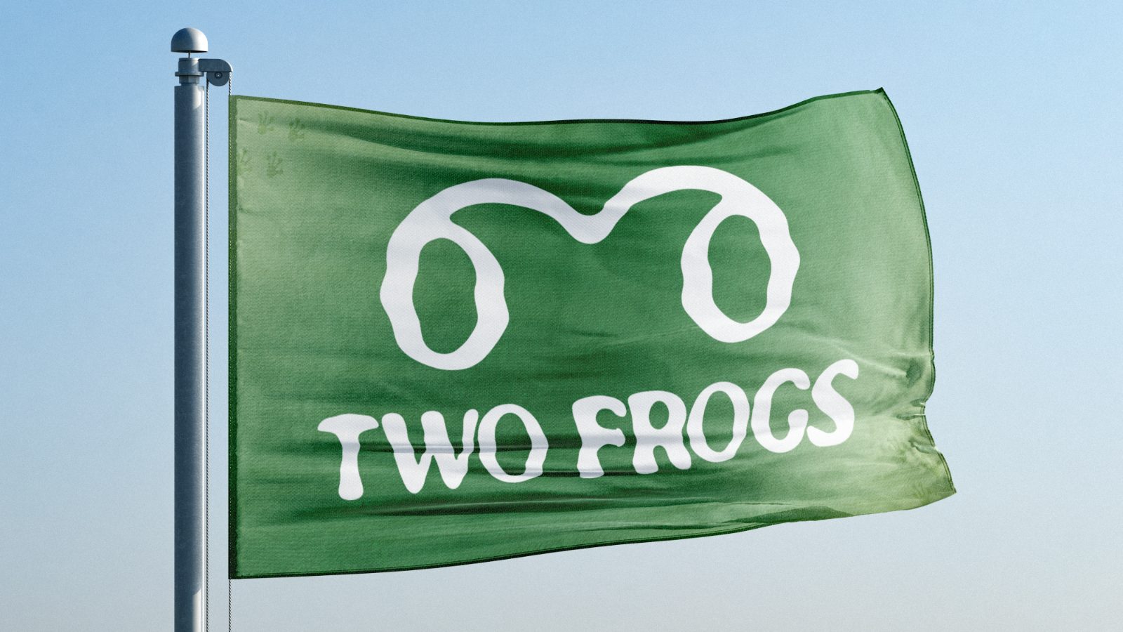
A concept identity for Two Frogs, an apparel brand for people who move between two worlds: city streets on a weekday, a trailhead by Saturday. Outdoor apparel shouts and urban basics disappear. This had to be recognisable across a street and calm enough never to look like it was trying. So the brand became a field guide: two watchful frogs, releases drawn as species, spruce and cream on kraft, and a numbered tag on every garment.
- Sector
- Apparel
- Year
- 2026
- Scope
- Identity, packaging, art direction
- Status
- Conceptual study



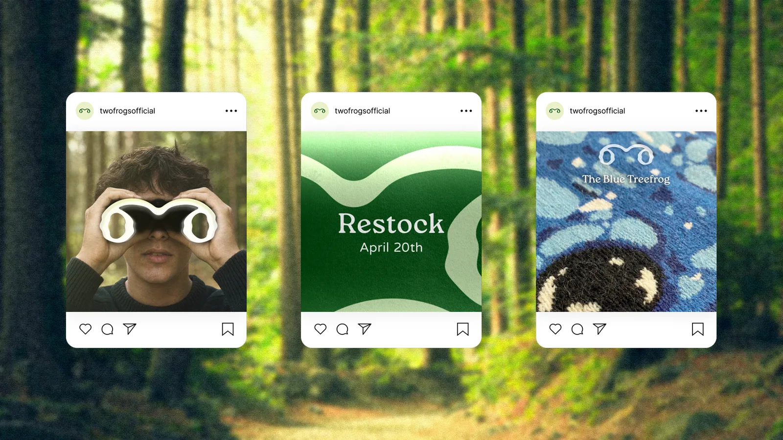
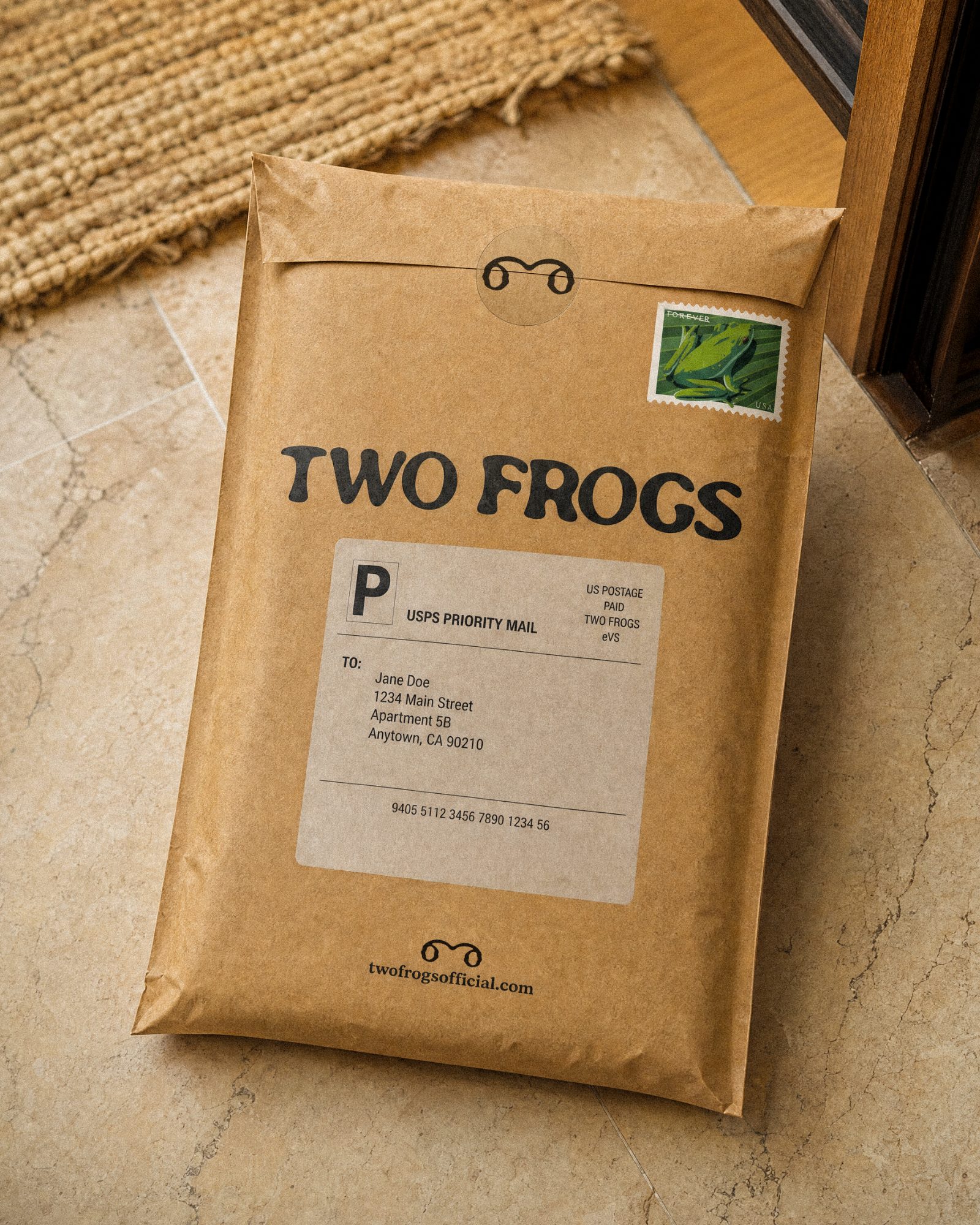

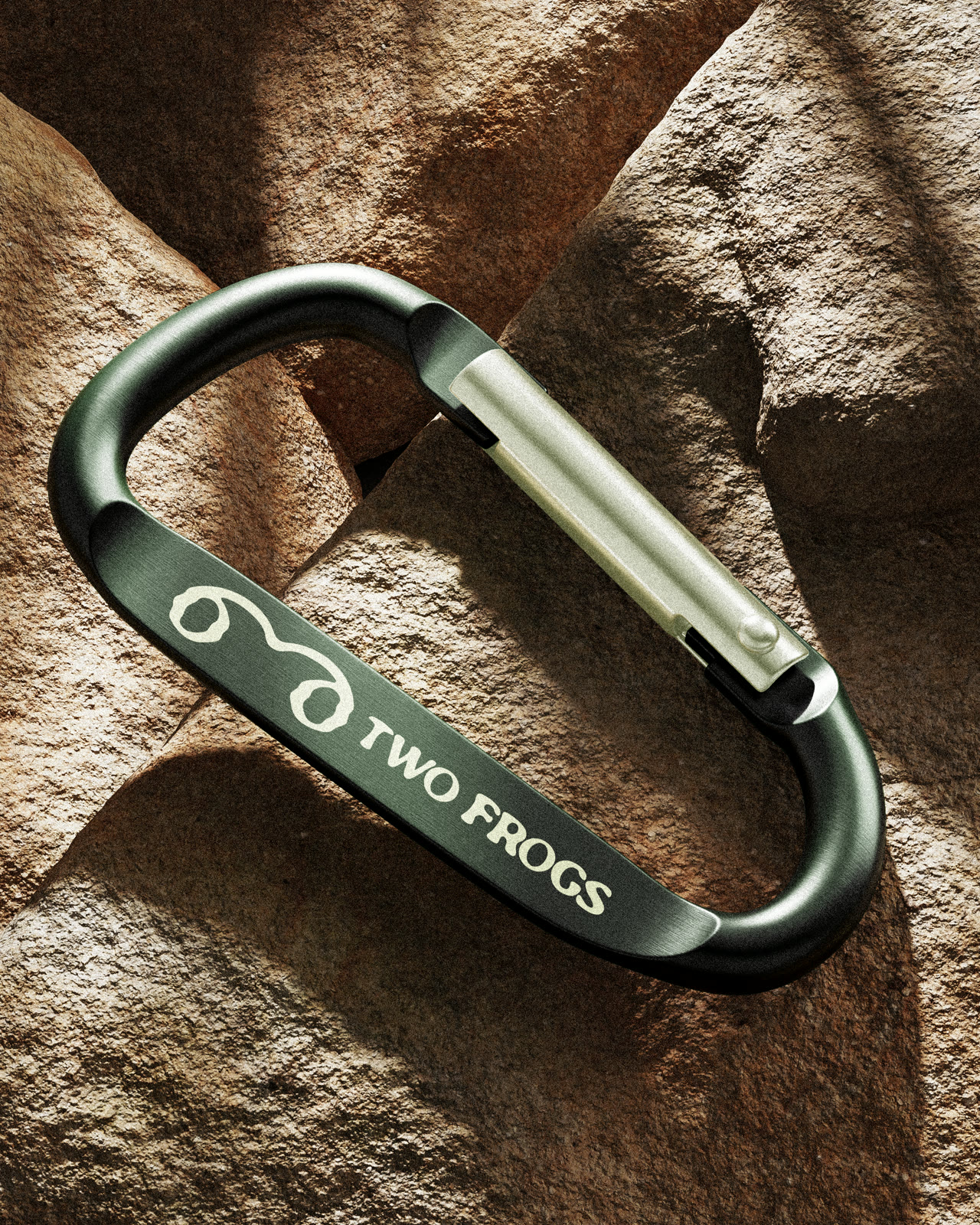
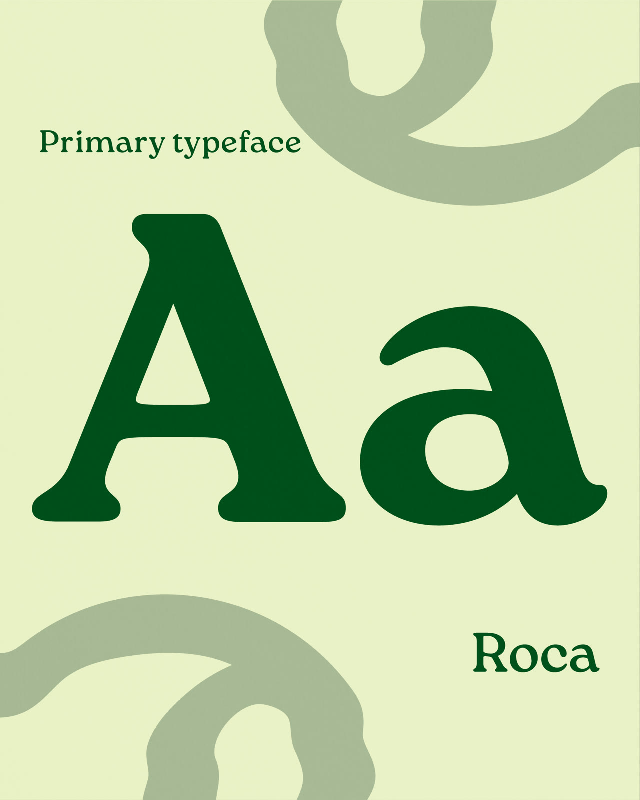
Set in Roca.
One typeface carries the whole brand. Roca is a soft, rounded serif with the warmth of an old field guide: it reads like a species plate, not a streetwear drop. Set large it holds the wordmark; set small it labels editions, Latin names and sighting numbers with the same calm voice.
Spruce on cream, cream on kraft. No second face, no display cut, nothing shouting. The restraint is the point: a brand that can be recognised across a street without ever looking like it is trying.