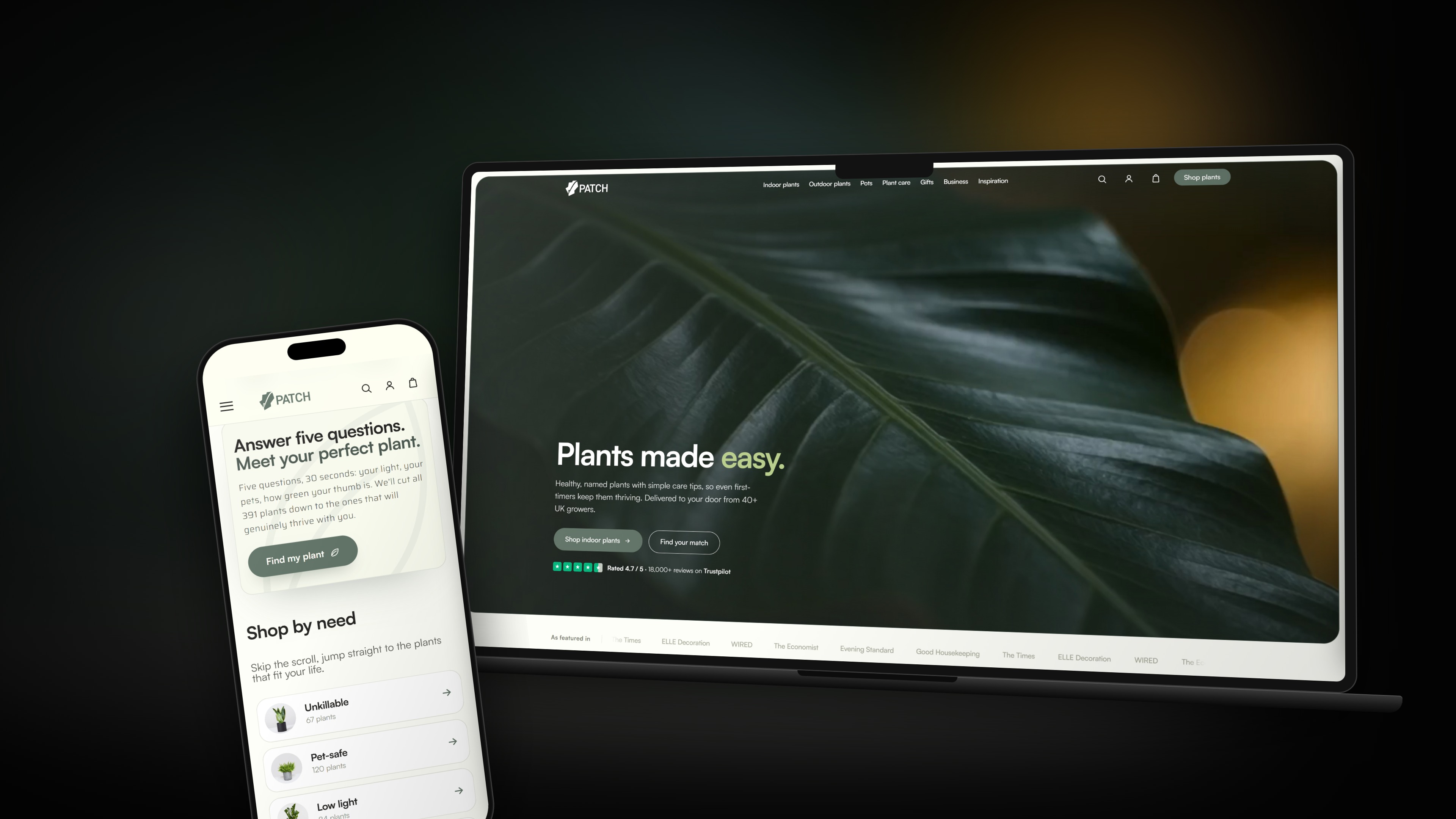
A concept rebrand and website for Patch, the plant delivery service that gives every plant a name. The idea genuinely works, but only in the product. The identity around it stayed generic, and the website cluttered. We rebuilt both around the personality: characterful where it counts, clean everywhere else.
- Sector
- Plant care
- Year
- 2026
- Scope
- Identity, web, packaging
- Status
- Conceptual study
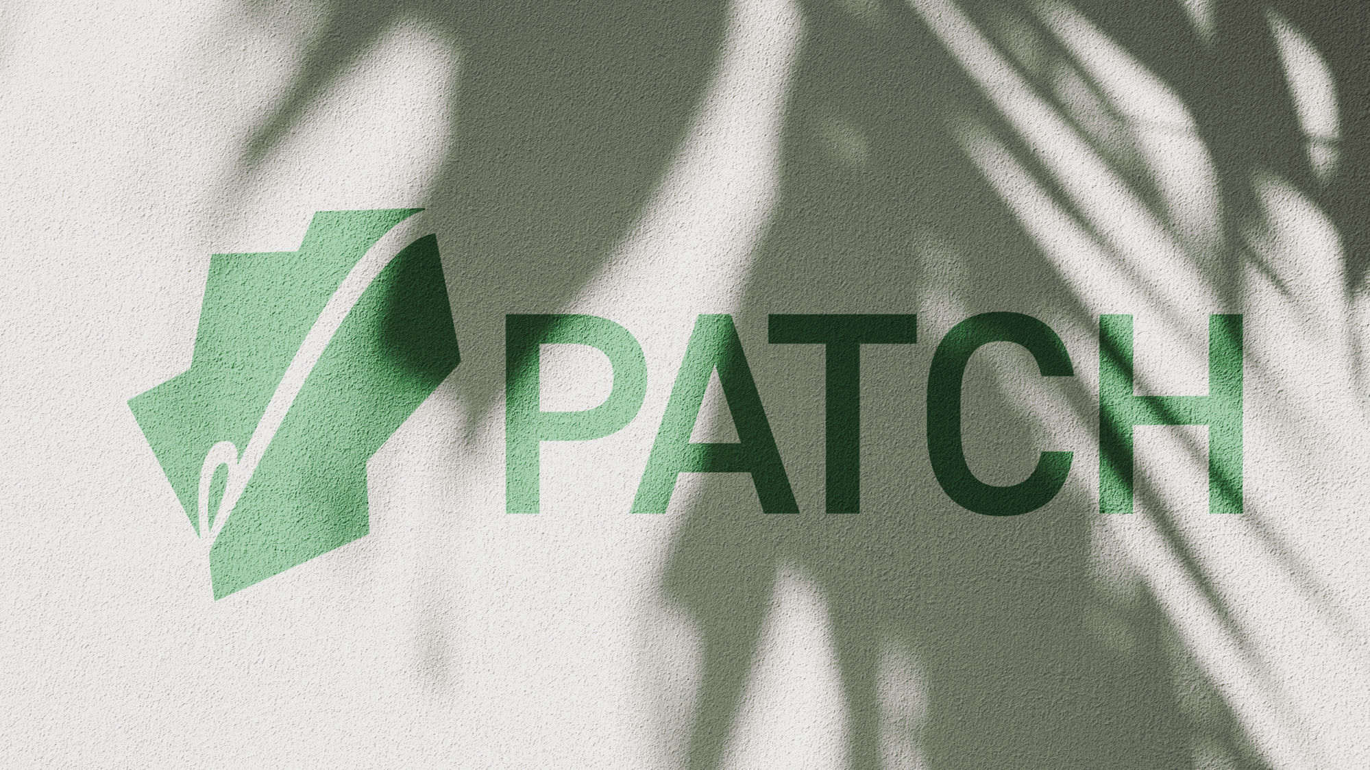

The mark.
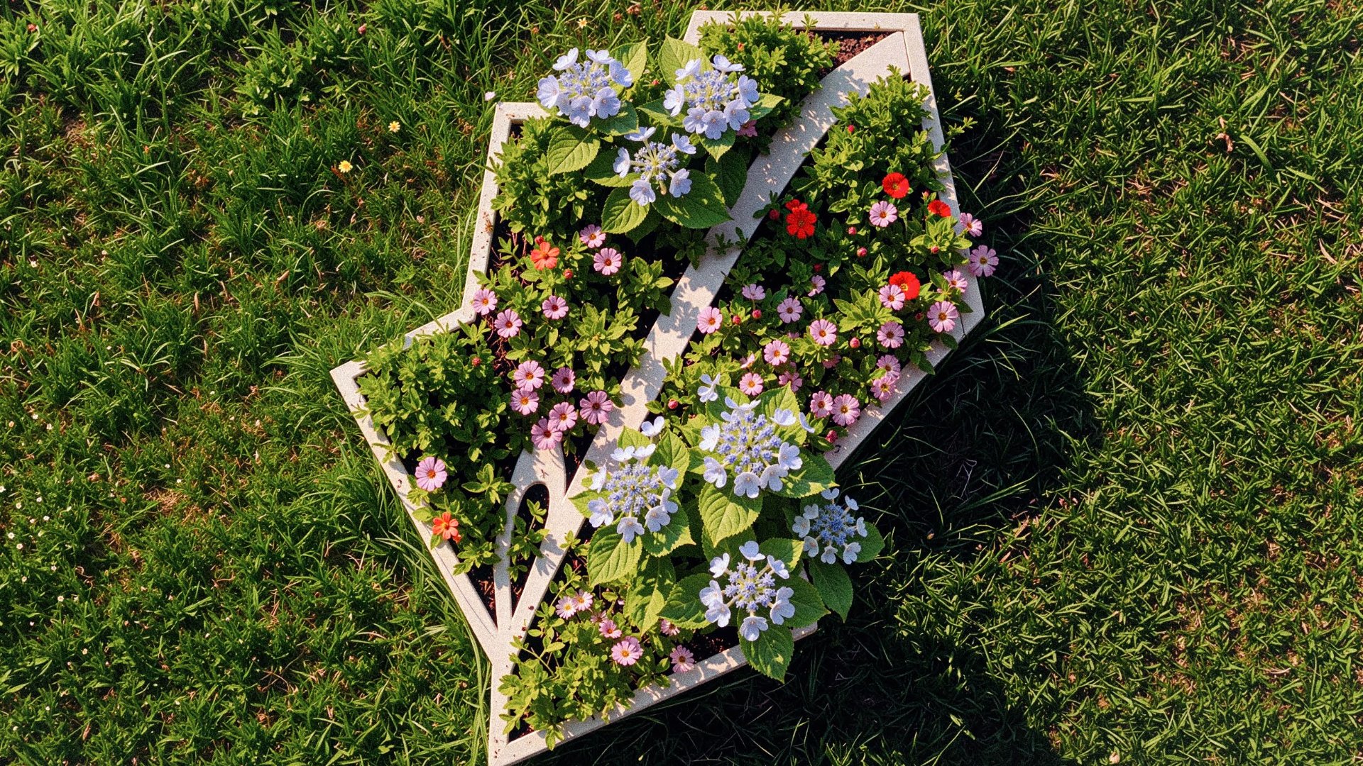
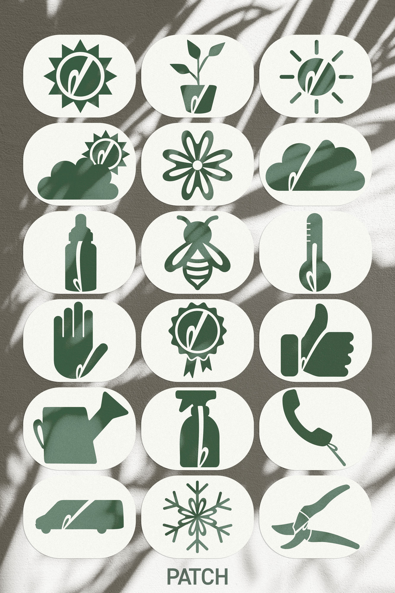
It started with a question: how do you put “plants you can trust” into one shape? A tick came first, quality and reliability in a single stroke, so we grew it into a leaf and built the letter P from its form. Then the loop gave us an idea: a needle and thread, stitched straight through the name. Patch, hiding in plain sight. A quiet nod to patching things up, including your track record with plants. Simple, recognisable, unmistakably Patch.
Why a refresh.
Patch already sells plants well. What we set out to fix, as a self-initiated study, is that the identity looked like any online shop: a green, a sans, a leaf. The thing people actually love, a plant with a name and a personality, lived in the copy but nowhere in the brand.
Pick a pot. Meet a plant.
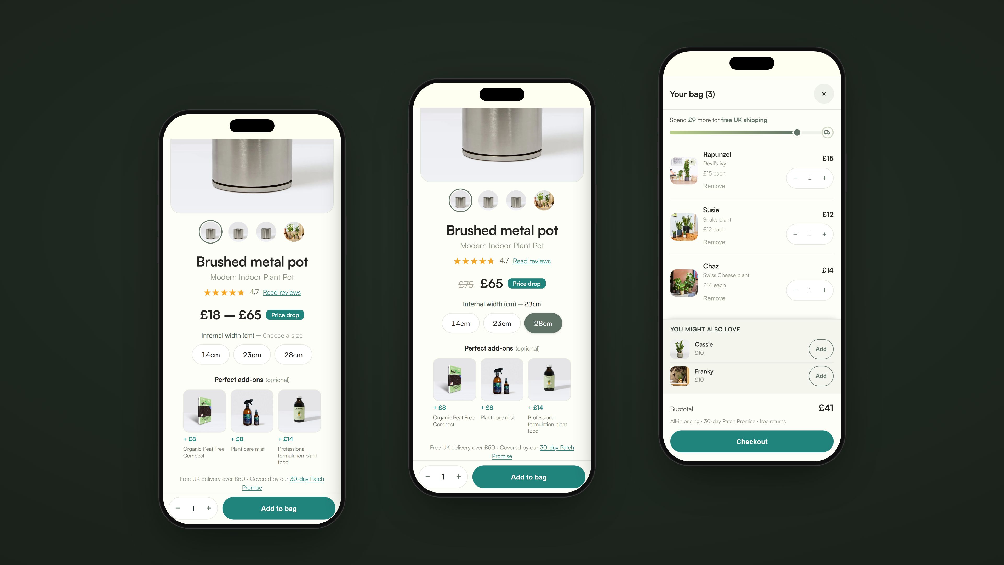
The visualiser lets you picture a plant in any pot before you buy. Swap the pot and the plant stays put, so you see the pairing you'll actually live with, not a guess from two product photos.
Colour with names.
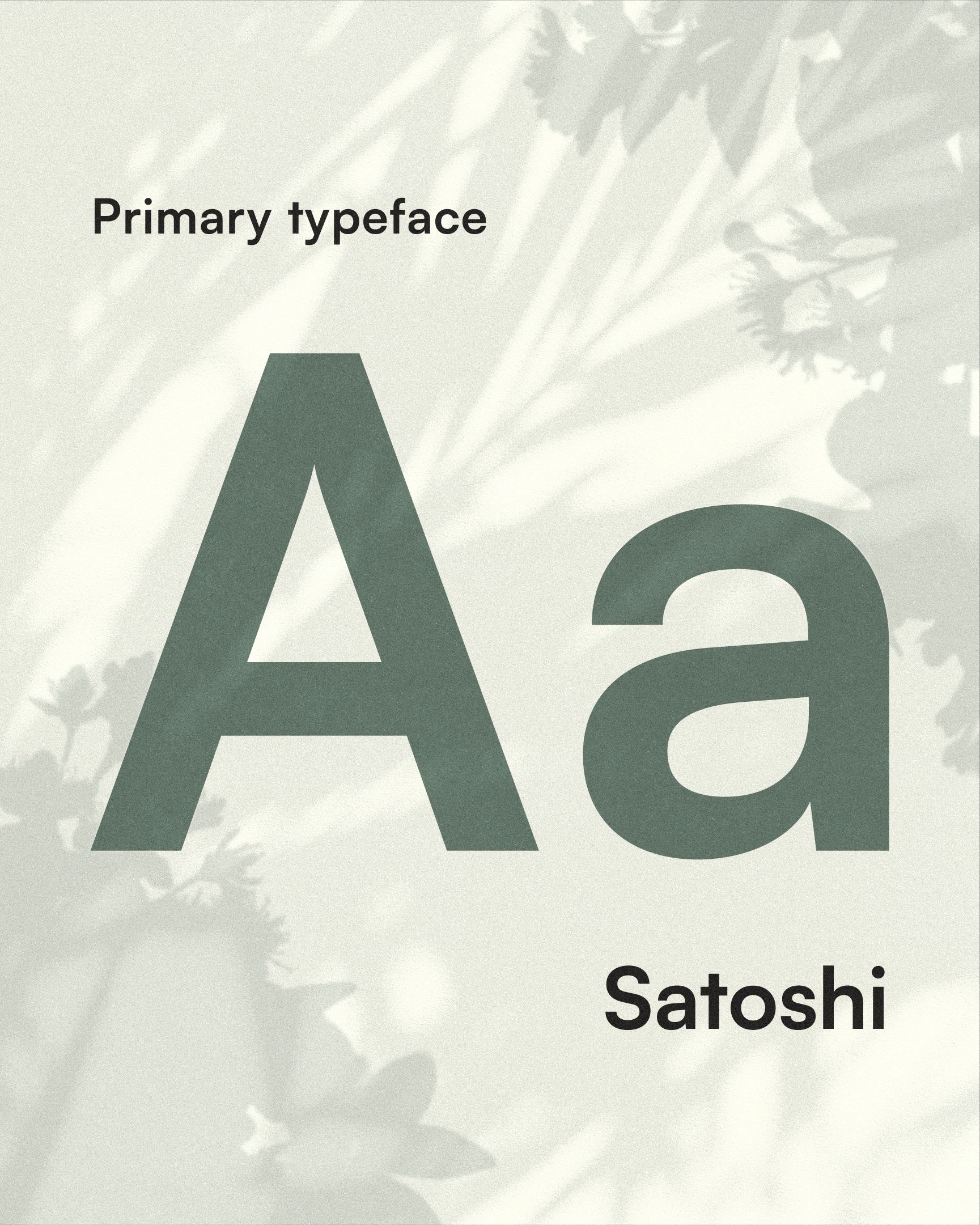
Six colours, each named after something you'd find in a nursery. Sage does the everyday work, Watering Can is the one you click, and cream stands in for white so nothing ever feels clinical. Tap a swatch to read why.
The challenge.
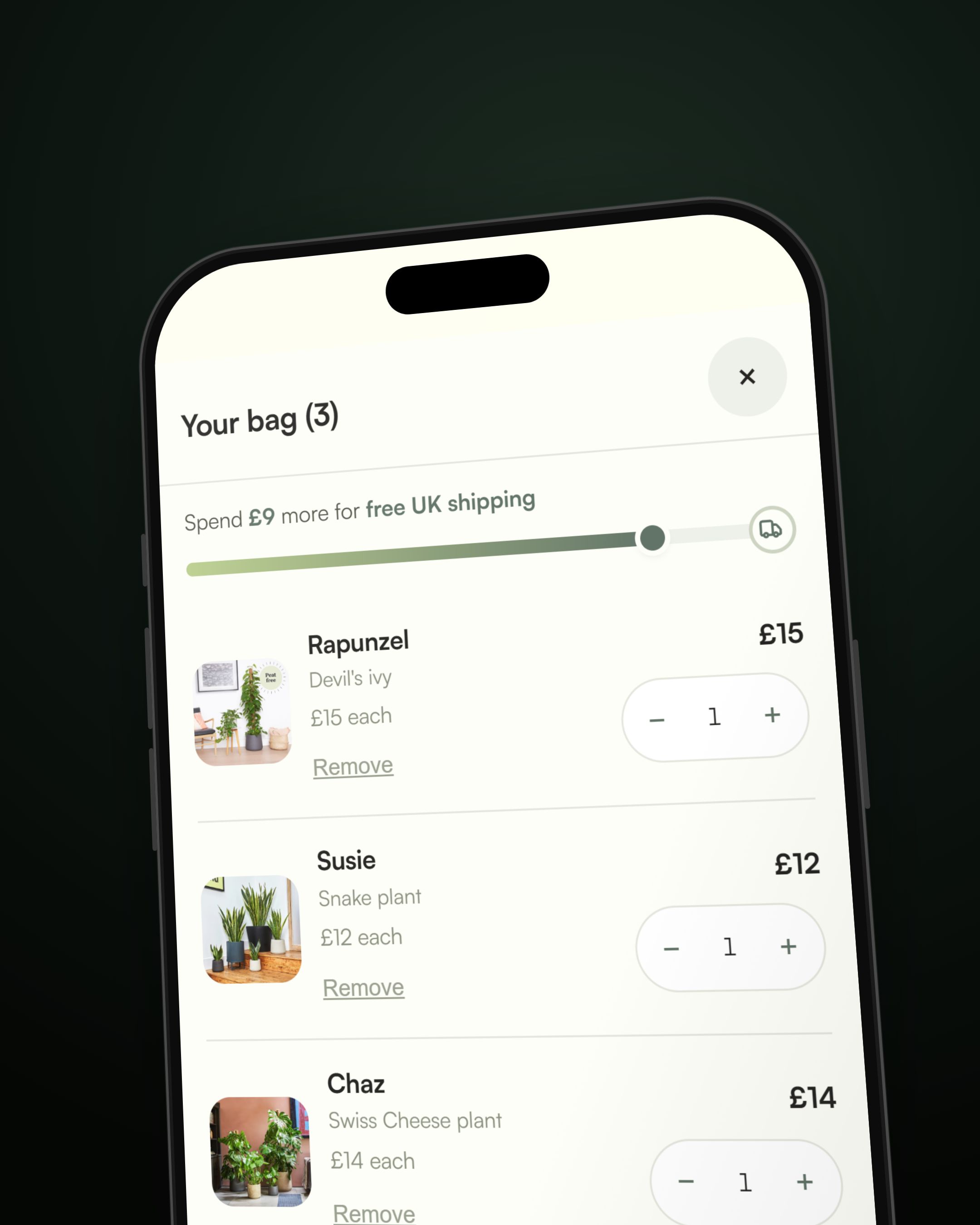
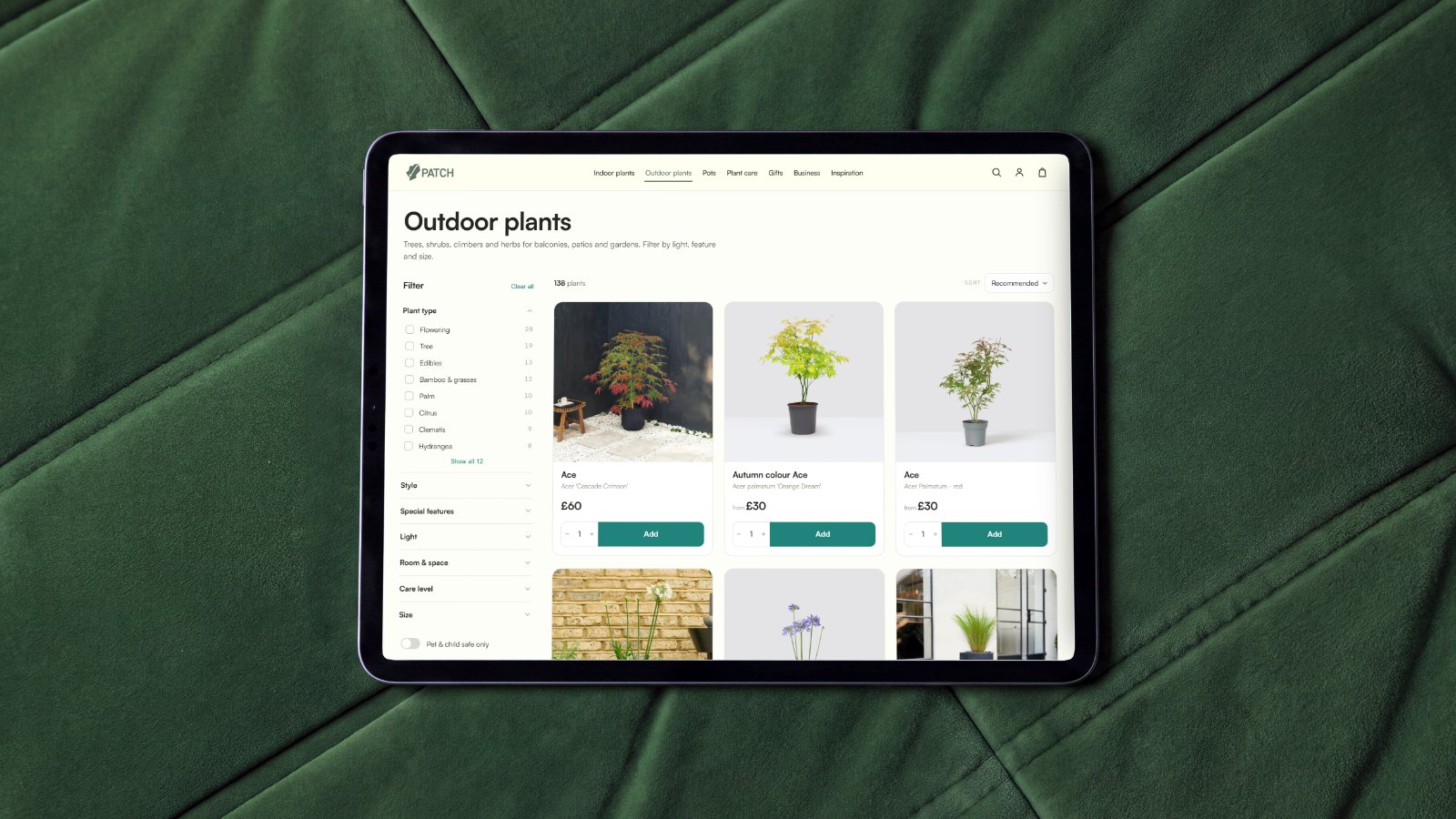
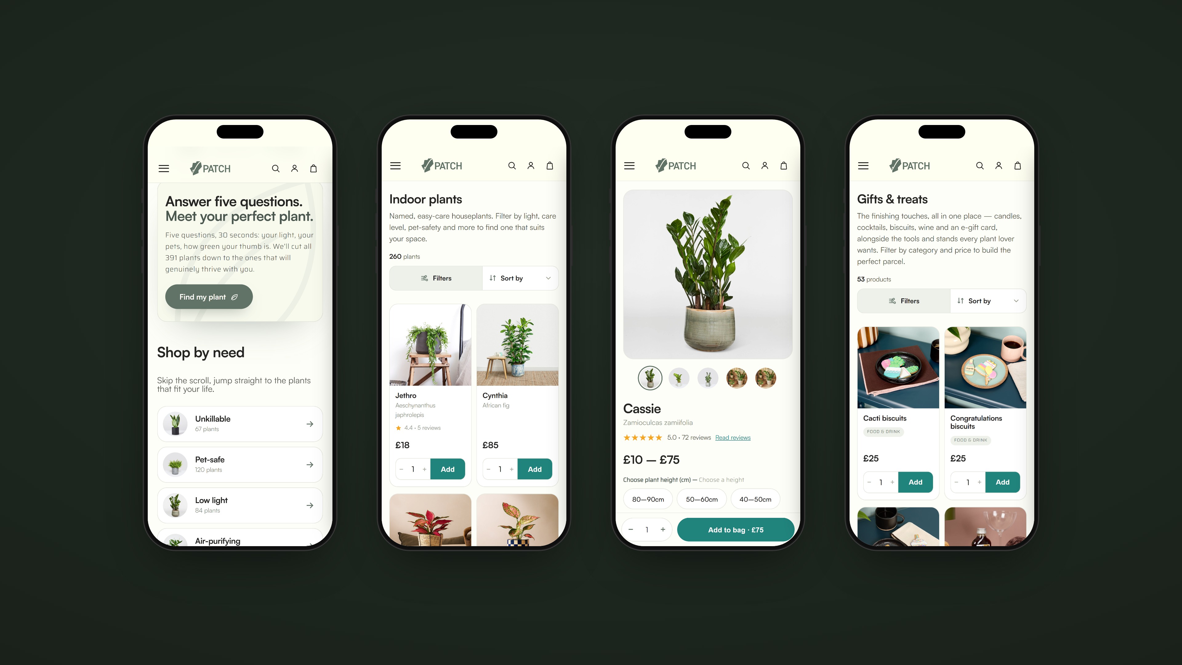
Patch had two problems pulling in opposite directions. The website was cluttered: too much on every page, a search that made you work for it, and paths to the plant you wanted that were longer than they needed to be. The branding was the opposite, plain to the point of anonymous. The logo did not capture the brand's character at all, and it sat awkwardly next to a site that had far more personality than the mark did.
So we set out to calm one down and turn the other up. Make the site cleaner, easier to search and easier to use. Give the identity the warmth the site already had, so the logo finally said what Patch is: the friend, adviser and partner who helps you keep a plant alive.
Out in the world.
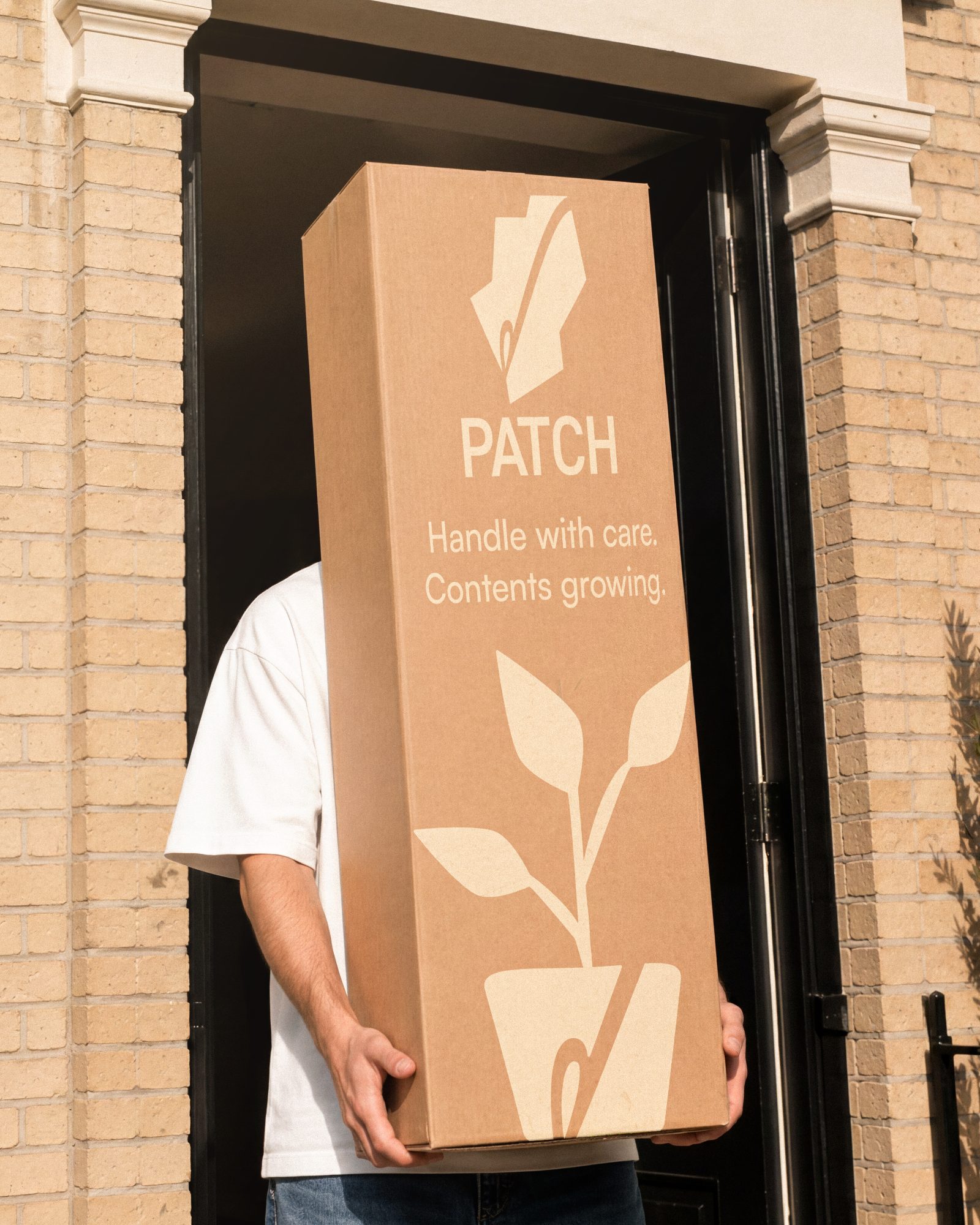
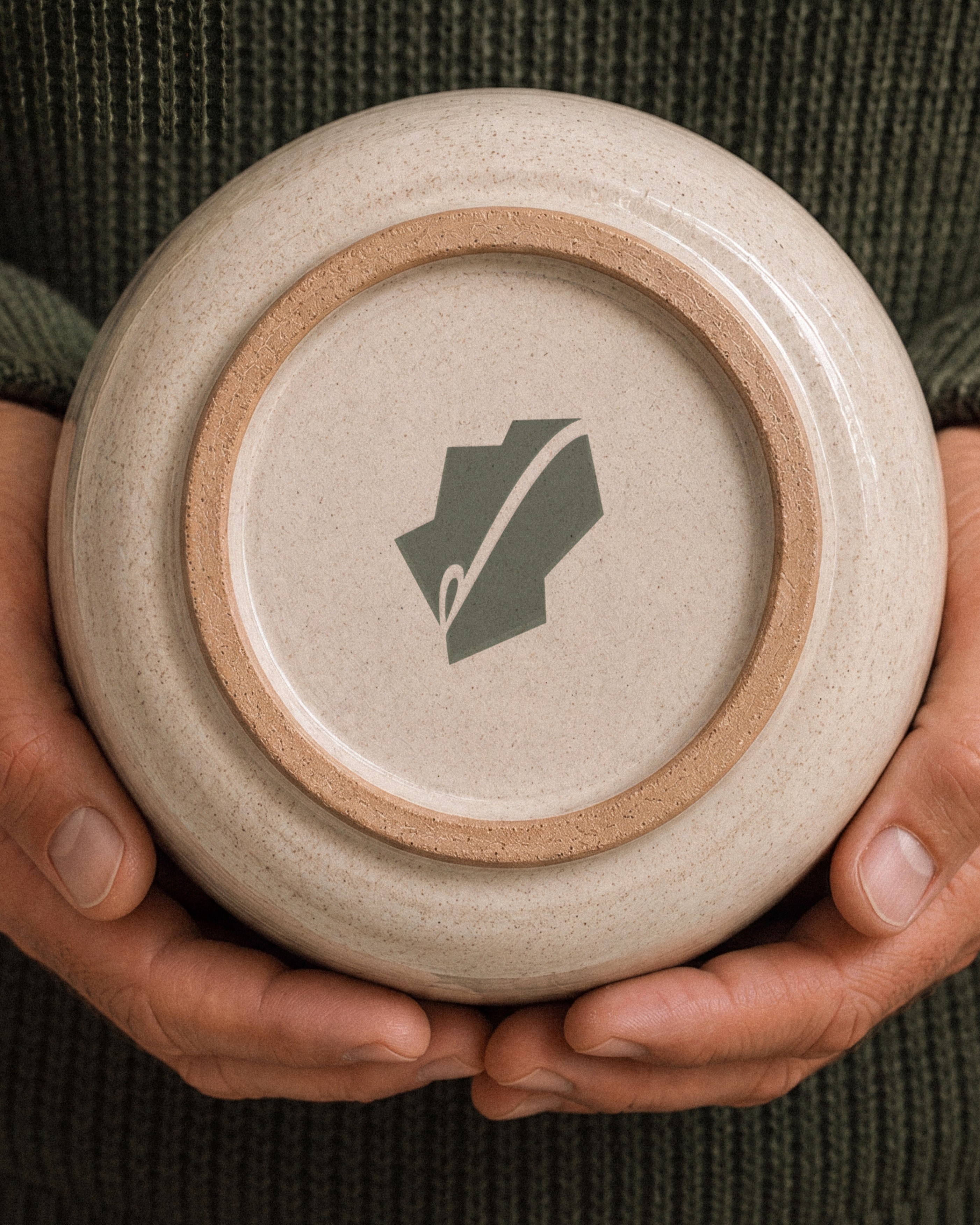
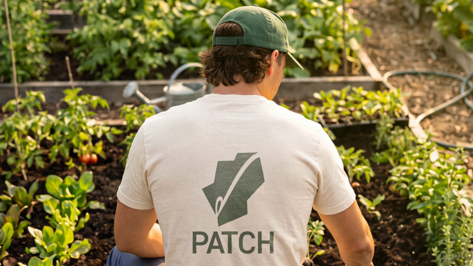
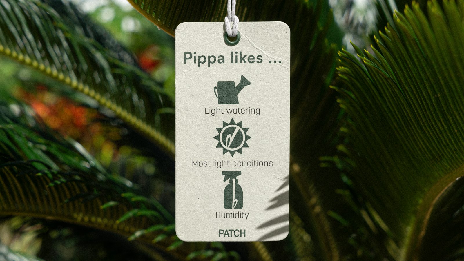
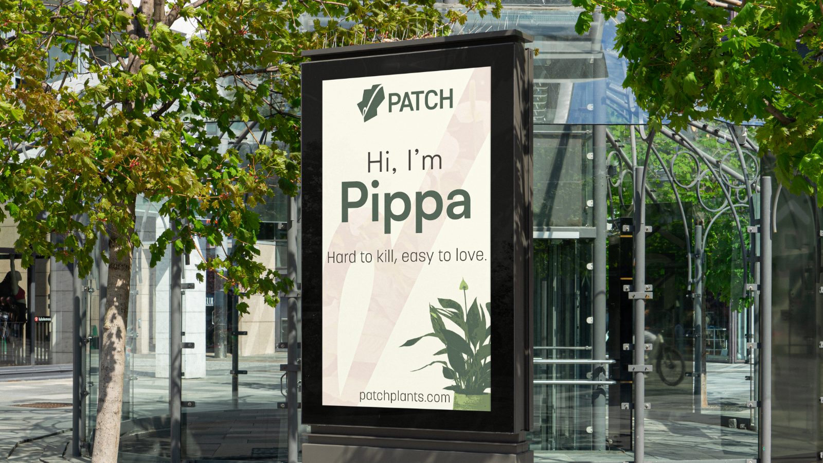
Boxes, pots, tees, gift cards and a lightbox. The wave goes on everything that leaves the nursery, so the brand is recognisable long after the tag comes off.